How to Read Stock Charts
The secrets of stock charts! Learn how to read stock charts and analyze prices, trends & signals to boost your trading game.
Common Indicators
Simple Moving Average
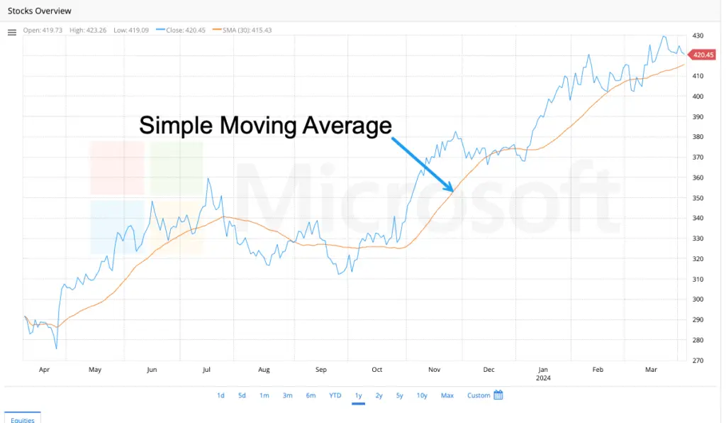
Imagine tracking the daily closing price of a stock. The price can fluctuate, making it harder to see the bigger picture. The simple moving average (SMA) smooths out price data by taking the average closing price over a specified number of days, such as 50 or 200 days.
Here’s how it works:
- Pick several days (lookback period). This is how much history you want to consider.
- Add up the closing prices for those days.
- Divide that sum by the number of days you chose.
Boom! That’s your SMA for that period.
What does the SMA tell you:
- Upward trend: If the SMA is going up, it suggests the price has generally been increasing over that period.
- Downward trend: If the SMA is going down, it suggests the price has generally been decreasing.
- Flat trend: If the SMA is flat, it suggests the price hasn’t been moving much in one direction or another.
Traders use SMAs in a few ways:
- Identify trends: As mentioned above, the direction of the SMA can signal the overall trend.
- Some traders buy when the price crosses above the SMA and sell when the price falls below the SMA. The idea is that prices will continue to climb in the first instance and fall in the latter.
Exponential Moving Average
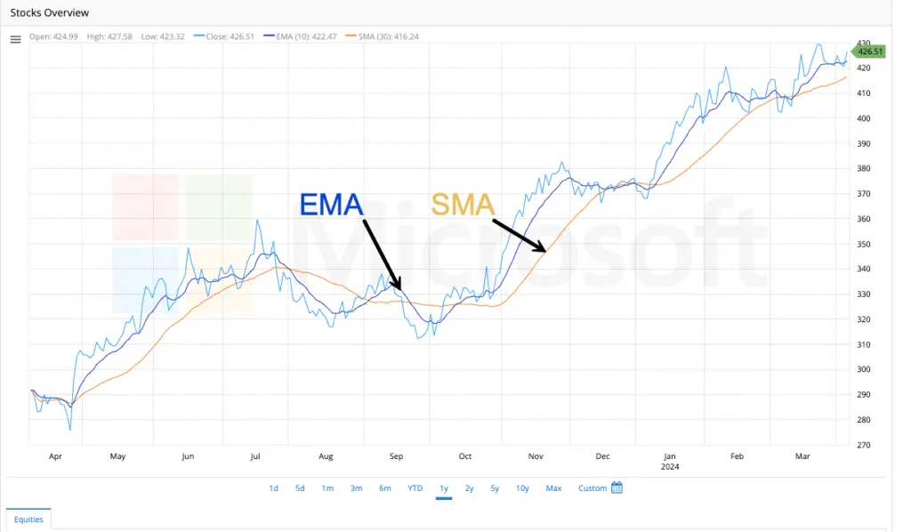
Think of a Simple Moving Average (SMA) as an average that weighs all price data points the same.
The EMA is similar, but it gives more importance to recent prices. It’s like a moving average that reacts faster to what’s happening now.
The EMA gives more weight to recent closing prices than older prices which have less weight. This makes the EMA more responsive to recent price movements.
Why do traders use EMA?
Since the EMA weighs recent prices more, the EMA can help identify trends quicker than the SMA. This can be helpful for traders who want to make decisions based on the latest market movements.
The EMA line is smoother than the SMA line because it is influenced by past data points but with less weight.
While EMAs can be useful, keep in mind:
Impacted by swings: The EMA reacts to and is sensitive to short-term price swings. As a result, it may not reflect the true trend.
- Not a perfect predictor: The EMA is a tool to help analyze trends, not a guaranteed way to predict future prices.
MACD (Moving Average Convergence Divergence)
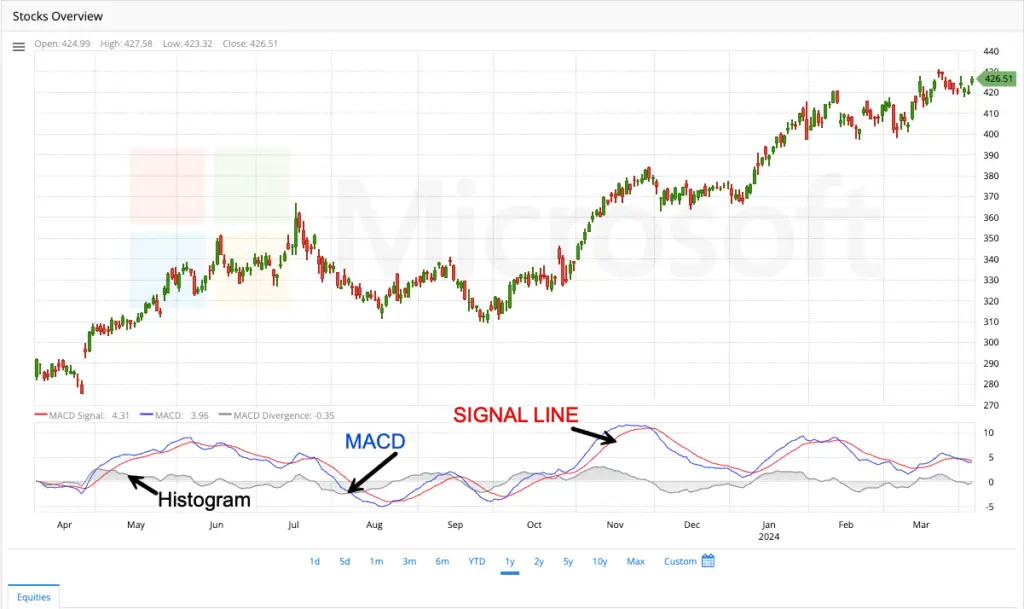
Let’s say you’re following a stock’s price and want to see if it’s gaining or losing momentum. The MACD is a tool that helps with this. It weighs the long-term and short-term averages of the price and shows how they interact.
Here’s a simplified breakdown:
The MACD uses two special moving averages, typically a 12-day and a 26-day EMA.
The MACD line itself shows the difference between these two averages.
Another “signal line,” smooths out the MACD line for easier interpretation.
What can the MACD tell you?
Trend direction: The general direction of the MACD line indicates the trend. An upward trend for bullish, and downward for bearish.
- Momentum:
The wider the gap between the MACD line and the signal line, the stronger the trend momentum.
- Potential buy/sell signals: There are various ways to interpret the MACD for trading signals, with some common ones being:
- Crossovers: When the MACD line crosses above the signal line, it may indicate a potential buying opportunity, and vice versa for a sell signal.
- Divergence: At times, the price movement may deviate from the MACD, indicating a potential shift in the trend.
Keep in mind:
- The MACD is a tool to help analyze trends, not a guaranteed way to predict future prices.
- Before making trading decisions, it’s important to consider other factors when interpreting MACD signals.
Relative Strength Index
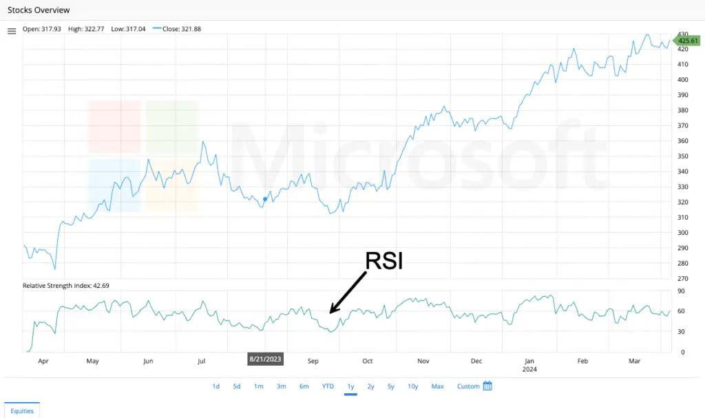
You’re watching a stock price and want to know if it’s due for a rise or fall. The RSI is a tool that helps with this by gauging how strong recent price movements have been. It considers how much the price has moved and how quickly those changes happened.
Here’s the basic idea:
- The RSI gives a score between 0 and 100.
- Generally, a score above 70 suggests the price might be overbought (meaning it may have risen quickly and could be due for a correction).
- A score below 30 suggests the price might be oversold (meaning it may have fallen too quickly and could be due for a rebound).
What can the RSI tell you?
- Overbought/oversold conditions: The RSI can’t predict the future, but extreme high or low readings suggest the price might be due for a move in the opposite direction.
- Momentum: The speed of recent price changes is factored into the RSI. A rapidly rising RSI might suggest strong buying pressure, while a rapidly falling RSI might suggest strong selling pressure.
Bollinger Bands
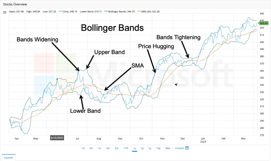
Bollinger Bands is a popular technical analysis tool that helps visualize the price movements and volatility of a stock. Here’s a breakdown to understand their usage on stock charts:
Components:
- Moving Average (MA): The center line represents a simple moving average (SMA) of the price over a chosen period (e.g., 20 days). This smooths out price fluctuations and reflects the stock’s general trend.
- Upper and Lower Bands: These lines are plotted two standard deviations above and below the moving average. Standard deviation is a statistical measure of price dispersion around the average. So, the bands act like envelopes that widen as prices become more volatile and contract during calmer periods.
Formula:
- Upper Band: MA + (Number of Standard Deviations) x Standard Deviation
- Lower Band: MA – (Number of Standard Deviations) x Standard Deviation
Interpretation:
Bollinger Bands offer insights based on the price’s relationship to the bands:
- Price near the Upper Band: This suggests a potential overbought condition, where the price may be inflated and due for a correction (price dip).
- Price near the Lower Band: This indicates a possible oversold scenario, where the price may be undervalued and ripe for a rebound.
Important Points:
- Bollinger Bands are relative indicators. A price touching the upper band might not always signal an overbought condition, especially if it’s steadily trending upwards. Similarly, a touch of the lower band doesn’t guarantee an oversold situation.
- Band Width: The distance between the upper and lower bands reflects volatility. Expanding bands suggest increasing volatility while contracting bands indicate lower volatility.
- Breakouts: Sharp price movements that break above the upper band or below the lower band can signal potential continuations of the trend in that direction. However, false breakouts can also occur.
Combining Bollinger Bands with Other Indicators:
Bollinger Bands are more effective when used with other technical indicators like RSI (Relative Strength Index) or MACD (Moving Average Convergence Divergence) to confirm trading signals.
By understanding these aspects, Bollinger Bands can be a valuable tool for traders to gauge market sentiment, identify potential entry and exit points, and manage risk during their stock chart analysis.
On Balance Volume (OBV)
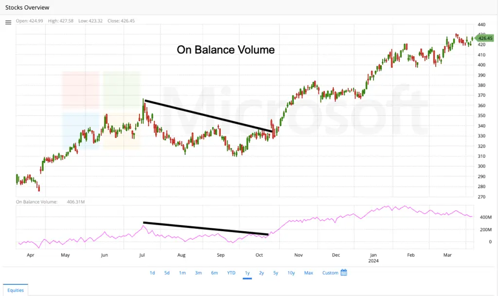
You are looking at a stock chart and you want to understand buying and selling pressure. The OBV is a tool that can help with this. It tracks the volume (number of shares traded) each day and considers whether the price went up or down from the previous day.
Here are the key ideas:
- If the price closes higher than the previous day, the OBV adds that day’s volume to a running total. This suggests possible buying pressure.
- When the closing price of a stock decreases, the On-Balance Volume (OBV) subtracts that day’s trading volume from the total volume. This helps in analyzing the buying and selling pressure in the market.
What can the OBV tell you?
- Buying vs. selling pressure: By analyzing the OBV line trend, you can determine if more buying or selling in the market.
- Potential trend direction: A rising OBV might suggest a buildup of buying pressure, potentially foreshadowing a price increase (bullish trend). Conversely, a falling OBV might suggest selling pressure, potentially foreshadowing a price decrease (bearish trend).
Remember:
- The OBV isn’t a perfect predictor of future prices. There can be other factors influencing price movements.
- The OBV is most helpful when used alongside other technical indicators on the stock chart.
Stochastics
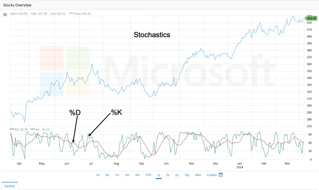
The Stochastic Oscillator is a tool used on stock charts to help identify potential buying and selling opportunities. It considers two things:
- The recent closing price of a security.
- The price range of that security over a chosen period (like 14 days).
Imagine the price range as a high-low “box” for the security over that period. The Stochastic Oscillator shows where the closing price falls within that box.
- High closing prices relative to the range will give a higher Stochastic reading (often above 70). This suggests the security might be overbought.
- Low closing prices relative to the range will give a lower Stochastic reading (often below 30). This suggests the security might be oversold.
Additional points to consider:
- The Stochastic Oscillator can be volatile, so a moving average is often used to smooth it out.
- The indicator itself doesn’t predict future prices, but the overbought/oversold zones can suggest potential reversals in the trend.
TRIX (Triple Exponential Average)
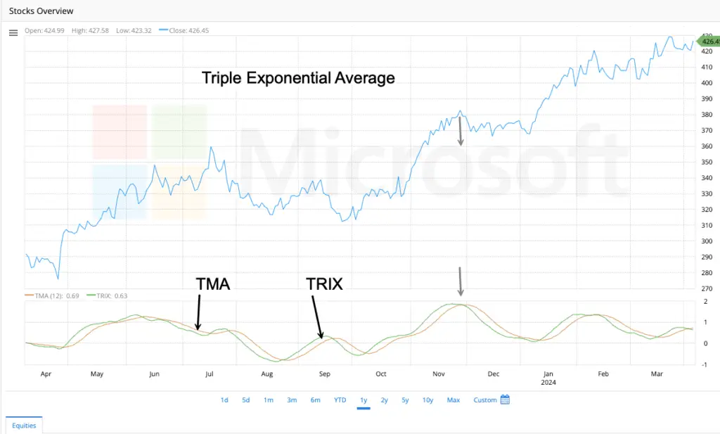
TRIX is a tool on stock charts that helps spot trends and potential buying/selling opportunities. It does this by looking at price movements and filtering out minor ups and downs that might be misleading.
Here’s a simplified breakdown:
- Think of a regular moving average that smooths out price data. TRIX takes it further by smoothing the moving average a few extra times to focus on the bigger picture.
- By filtering out short-term noise, TRIX can help identify stronger trends, whether up or down.
- Similar to other indicators, TRIX can sometimes generate buy/sell signals based on their direction and crossover with another line (called a signal line).
Remember:
- TRIX is a tool for analysis and not a guaranteed predictor of future prices.
- It is commonly used with other technical indicators to provide a more comprehensive perspective.
Chaikin’s Volatility
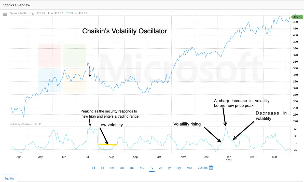
This indicator is named after Marc Chaikin, a well-known stock analyst who developed various tools to help investors analyze markets.
You are tracking a stock’s price and want to understand how much it’s swinging up and down. The Chaikin Volatility indicator is a tool that helps with this. It calculates the difference between the highest and lowest prices of a security within a chosen time frame, such as 20 days.
The key idea is :
- A high Chaikin Volatility reading means the price has been moving up and down a lot within that period, suggesting high volatility.
- A low Chaikin Volatility reading means the price hasn’t been swinging much, suggesting lower volatility.
What can Chaikin Volatility tell you?
- Market Stability: It can help gauge how stable or volatile the price movements are for a security.
- Potential Turning Points: Sometimes, sharp increases in volatility can precede market tops or bottoms, it can be a clue for potential trend reversals.
Price Overlays
Envelopes
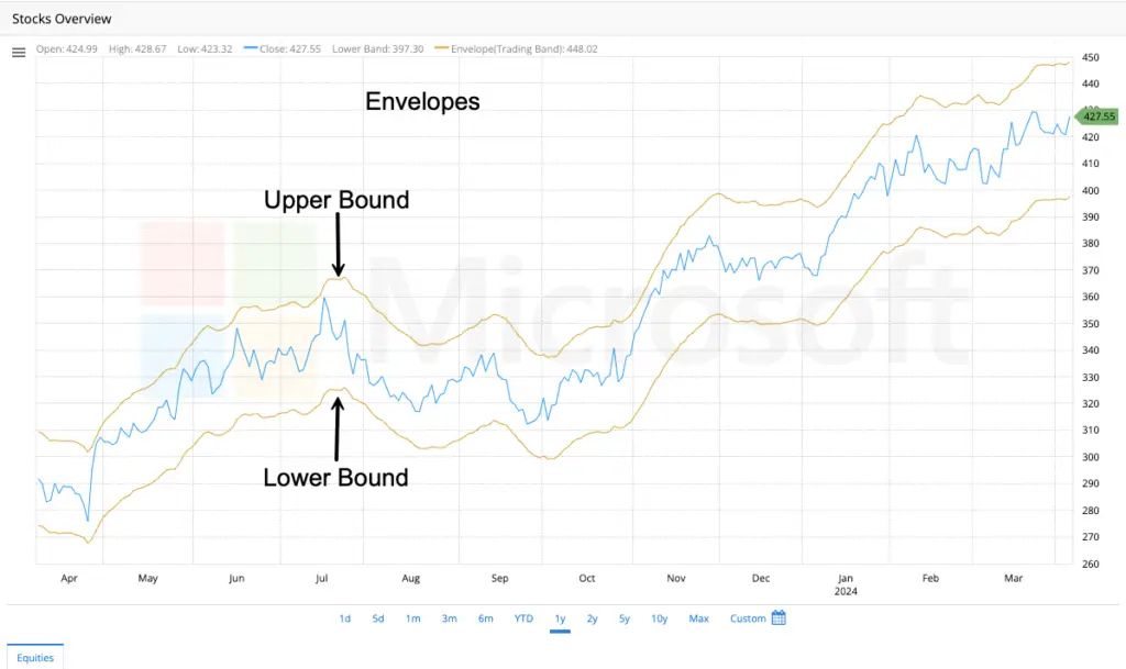
Envelopes: Gauging Price Stretch
Have you ever felt like a stock’s price has stretched too thin or inflated too quickly? Envelopes, a technical analysis tool, can help you visualize this. Imagine them as flexible bands wrapped around the price line on a stock chart.
How Envelopes Work:
Envelopes are created using two moving averages, one plotted above the price and one below. The distance between these lines and the price line is typically set as a percentage of the average price movement. This creates a dynamic channel that expands and contracts as price volatility fluctuates.
What Envelopes Can Tell You:
Overbought/Oversold Signals:
When the price shoots up and touches the upper envelope, it might be a sign the market considers it overbought. This suggests the price might be due for a correction. Conversely, if the price plunges and touches the lower envelope, it might be nearing oversold territory, potentially indicating a buying opportunity.
Envelopes: A Cautionary Tool
While envelopes help identify potential overbought/oversold conditions, it’s important to remember they are not crystal balls. A price touching an envelope doesn’t guarantee a guaranteed reversal. It’s always wise to use envelopes with other technical indicators and consider broader market factors before you make any trading decisions.
Median Price
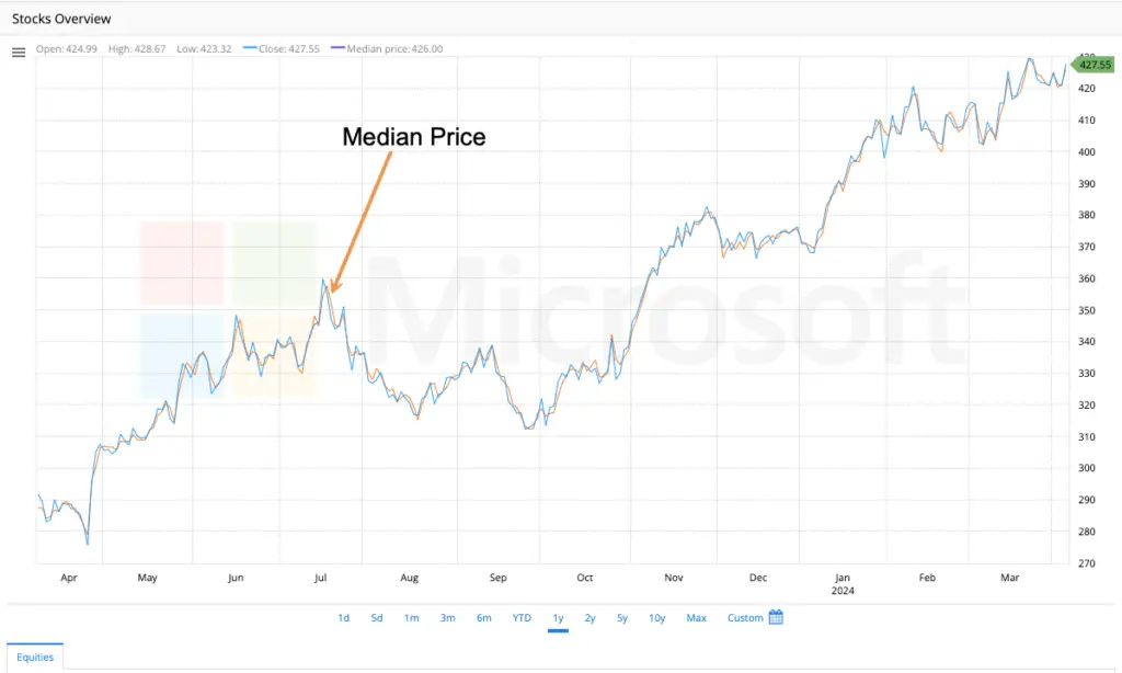
- The median price of a security within a given time frame is the price that lies exactly in the middle when all the prices are sorted in order from lowest to highest.
- If an odd number of prices are recorded, the median price is the price in the middle. If an even number of prices are recorded, it is the average of the two middle prices. For example, if the recorded prices are $15, $17, or $20, the median price would be $17.
- The median price is less influenced by extreme price movements (very high or low trades) when compared to the closing price.
Triangular MA (Triangular Moving Average)
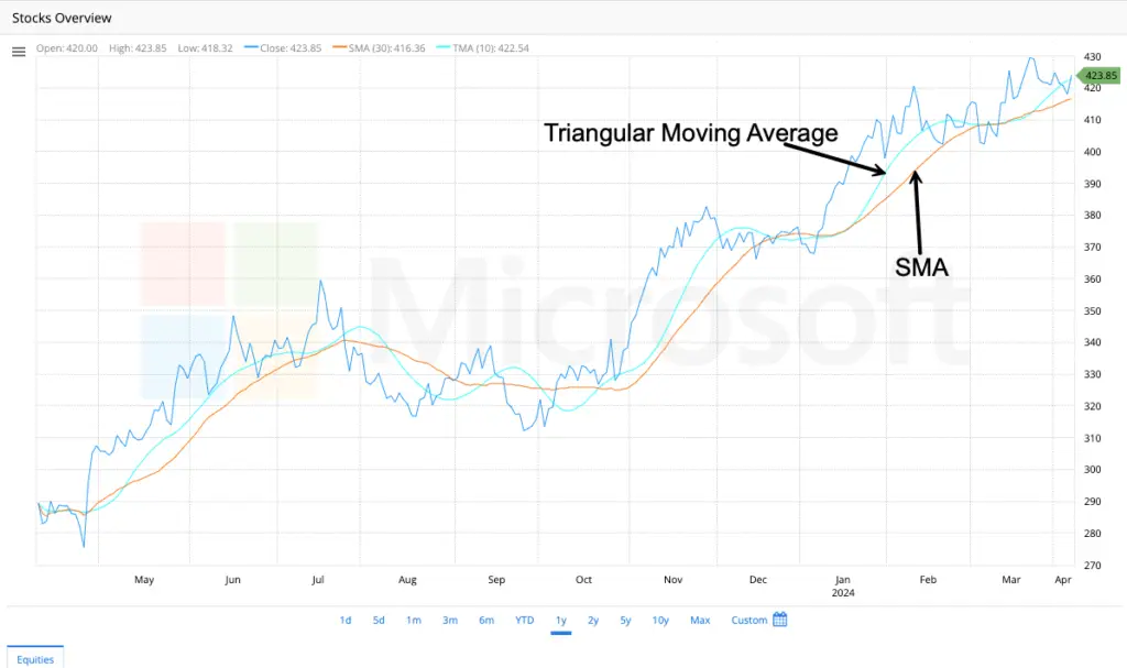
Have you ever looked at a stock chart with squiggly lines and wished it were smoother? The TMA can help with that! It’s a special type of moving average that smooths out price fluctuations even more than a regular moving average.
Here’s the key idea:
- Imagine a regular moving average that takes the average price over a certain number of days. The TMA takes that a step further by averaging the moving average itself! This double-smoothing helps reduce short-term ups and downs.
- Because it’s smoother, the TMA is often used to identify long-term trends in the market, whether prices are generally going up or down.
Benefits of using the TMA:
- Clearer Trend Lines: The smoother line of the TMA can make it easier to spot long-term trends compared to a regular moving average.
- Less Noise: The TMA (Triple Moving Average) is a technical indicator that smooths out short-term price fluctuations and focuses on the larger trend of price movements. This helps traders to get a clearer picture of the overall market direction.
Keep in mind:
- The TMA reacts slower to price changes because of the double-smoothing.
- It’s a tool to help analyze trends, not a guaranteed way to predict future prices.
Typical Price
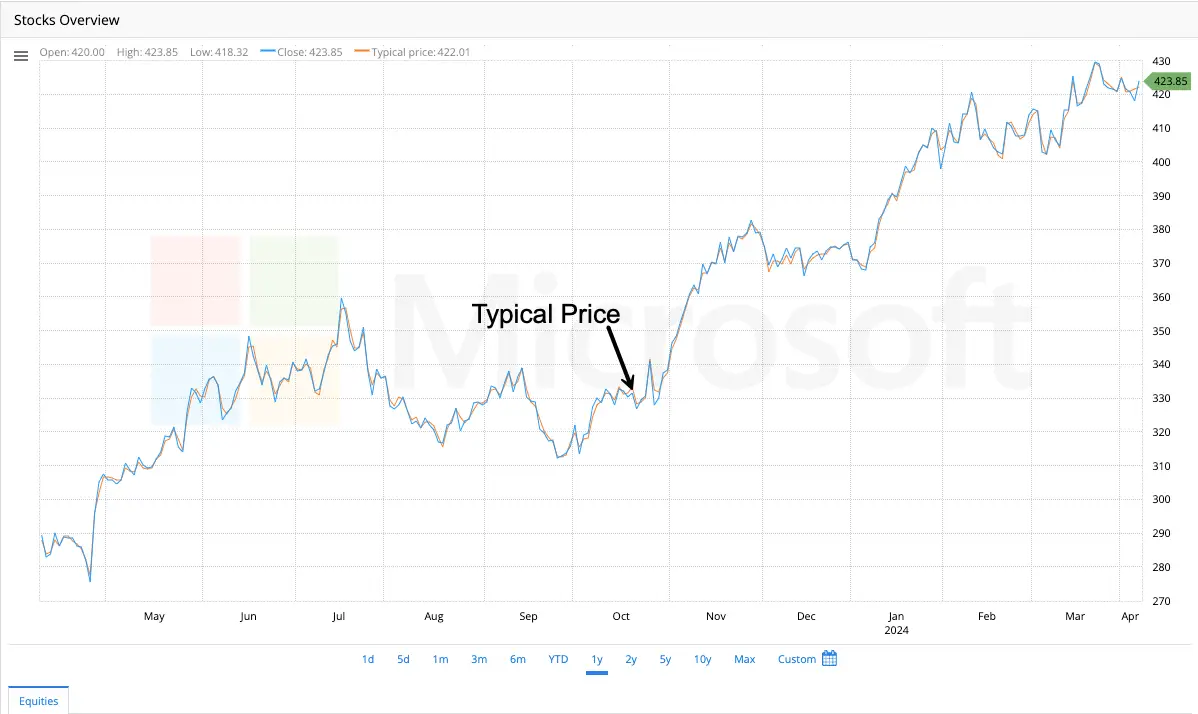
- The typical price is calculated as the sum of the high, low, and close prices divided by three. It is a simple way to get a general sense of a security’s price movement within a specific timeframe (like a day).
- The typical price offers a quick snapshot, whereas moving averages take more data points into account.
Weighted Close
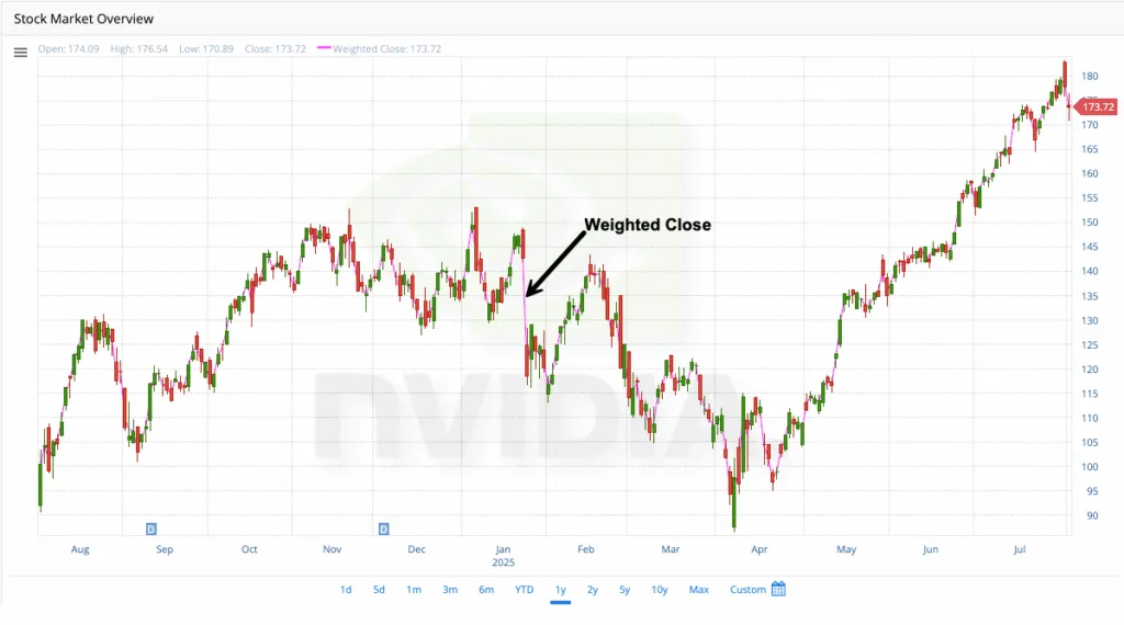
Let’s say you’re tracking a stock’s price throughout the day and the closing price is important, but it doesn’t tell the whole story. The weighted close considers the high, low, and closing prices, but gives the closing price more weight.
Here’s the basic idea:
- It’s like a simple average of the high, low, and closing prices, but the closing price counts a little more.
- This gives a more balanced view of the price action for that day compared to just using the closing price alone.
Why use the weighted close?
- More representative price: The weighted close provides a more accurate view of the day’s overall price activity.
- Basis for other indicators: Some technical analysis tools use the weighted close as a starting point for their calculations.
Keep in mind:
- The weighted close is a simple way to analyze price movements and not a foolproof method for predicting future prices.
Weighted Moving Average
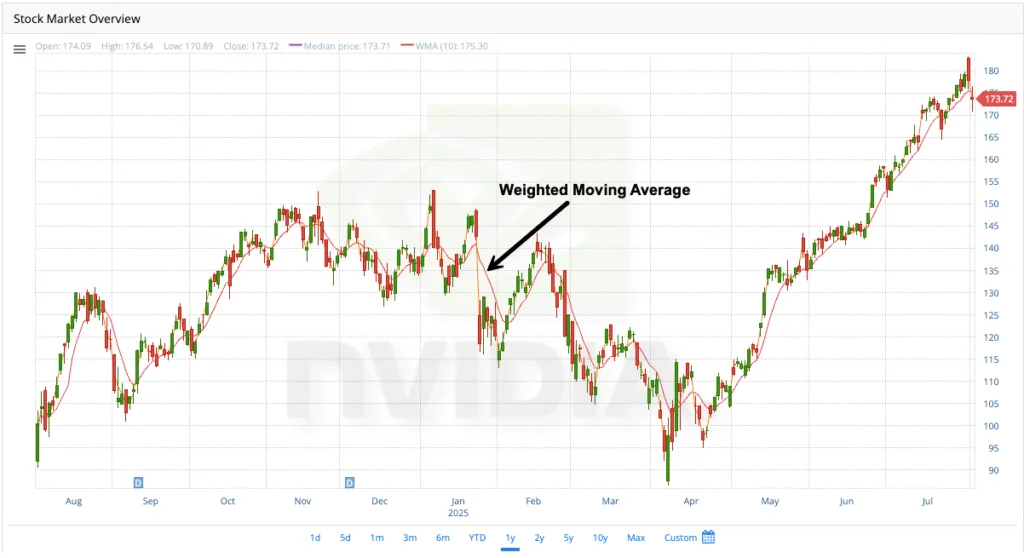
- The Weighted Moving Average is an average that allocates varying weights to each data point within a specified window. In contrast to the Simple Moving Average (SMA) which gives equal importance to all values, the WMA weighs more on recent prices and decreases the weightage for older prices in the considered period.
- Traders often use WMA because it accurately reflects recent market activity. It is commonly used alongside other technical indicators to identify market trends and potential reversal points. Its focus on recent prices means that the WMA follows the price activity more closely than a Simple Moving Average.
Technical Indicators
Avg. True Range (Average True Range)
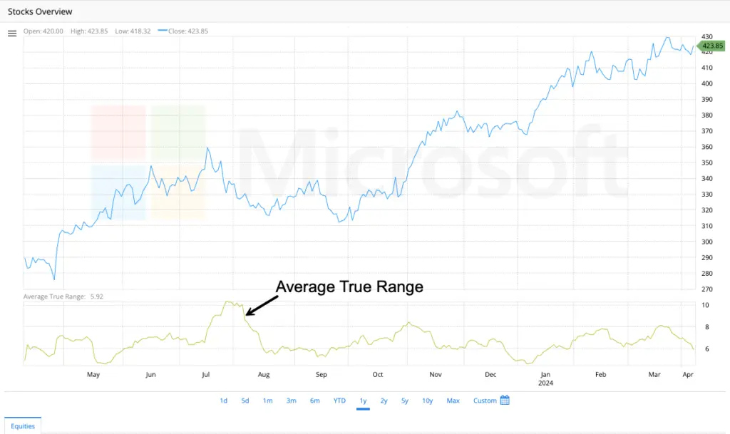
- ATR is an indicator that measures market volatility by decomposing the entire range of an asset price for that period. It measures the volatility caused by gaps and limits up or down moves.
Commodity Channel Index
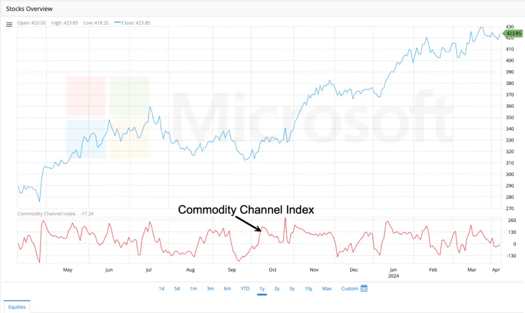
CCI is an oscillator often used in technical analysis to identify when a security has been overbought or oversold. It compares the current price with an average price over a given period and can signal divergences from typical price movements.
- Positive CCI values
Bullish Momentum: This indicates that the price is above its average, suggesting upward price movement and bullish momentum.
Strong Trends: A high positive reading in the CCI (typically above +100) indicates strong upward pressure and a robust uptrend.
Overbought Conditions: When the CCI value exceeds +100, the market is considered to be overbought, potentially signaling a price pullback or reversal. - Negative CCI values
Bearish Momentum: This suggests that the price is below its average, indicating downward price movement and bearish momentum.
Weak Trends: A low negative reading (typically below -100) reflects weak price action and a possible downtrend.
Oversold Conditions: When the CCI value falls below -100, the market is considered to be oversold, potentially signaling a price rebound or reversal. - Important considerations
Zero Line: The CCI oscillates around a zero line. Values between -100 and +100 are considered the normal trading range and don’t typically generate strong buy/sell signals.
Unbounded Oscillator: Unlike indicators with fixed boundaries (like RSI), CCI is unbounded, meaning it can go beyond the typical +100 and -100 levels. Extremely high or low values suggest very strong trends rather than guaranteed reversals. - Confirmation with other indicators: While CCI can be a useful indicator, relying on it alone for trading decisions is not advisable. By combining it with other technical analysis tools and confirmation from price action can improve accuracy.
Detrended Price Oscillator (DPO)
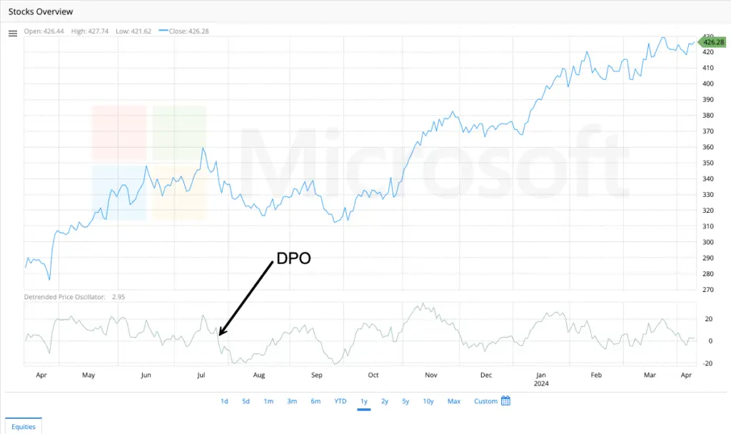
The DPO is a technical indicator used to identify short-term cycles and overbought/oversold conditions by eliminating the influence of long-term trends from a time series.
It oscillates around a zero line and compares past prices to a displaced (shifted to the past) Simple Moving Average (SMA). Here’s what positive and negative DPO values signify:
- Positive DPO Values:
This indicate that the price of the asset was above its SMA during the period being considered.
It may suggest upward momentum or that the asset is currently in an overbought condition. - Negative DPO Values:
This indicate that the price of the asset was below its SMA during the period being considered, and could suggest a downward momentum or that the asset is currently in an oversold condition. - Things to know about the DPO:
Lagging Indicator: The DPO is a lagging indicator, meaning it’s based on past price data. It should not be used in isolation but rather with other technical indicators to confirm signals and improve trading decisions.
Cycle Identification: The primary purpose of the DPO is to identify cycles in price movements, not to generate direct trading signals. Peaks and troughs in the DPO can help estimate the length of typical price cycles for an asset.
No Trend Indication: The DPO is designed to remove the trend from price, so it doesn’t provide information about the overall direction of the market.
Mass Index
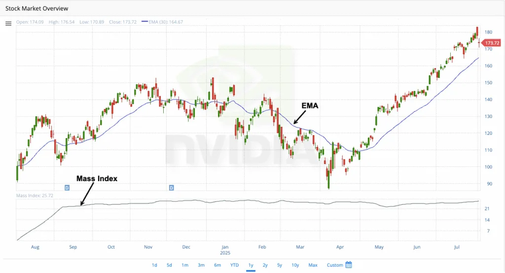
The Mass Index is a technical analysis tool developed by Donald Dorsey. It helps traders identify potential trend reversals by analyzing the range between high and low prices over a specific time period. This indicator is a measure of volatility and does not have a directional bias; instead, it signals the potential for a reversal without indicating the direction of the new trend.
**How It Works:**
1. **Focus on Price Range:** The Mass Index examines the narrowing and widening of the trading range, which is the difference between the highest and lowest prices.
2. **Identifying Potential Reversals:** It highlights periods when the trading range expands significantly, indicating increased volatility and a potential trend reversal.
3. **Reversal Bulge Signal:** Dorsey recognized a “reversal bulge” as a crucial signal. This occurs when the Mass Index initially rises above 27 and then drops below 26.5.
**How It’s Measured:**
To calculate the Mass Index, follow these steps:
1. **Calculate the Daily Range:** Subtract the low price from the high price for each day.
2. **Compute the 9-Day EMA:** Calculate the 9-day Exponential Moving Average (EMA) of the daily range.
3. **Compute the Double 9-Day EMA:** Calculate the 9-day EMA of the 9-day EMA of the range.
4. **Calculate the EMA Ratio:** Divide the first EMA by the second EMA.
5. **Sum the EMA Ratios:** Add the EMA ratio values over the last 25 days.
**Notes:**
– **No Directional Bias:** The Mass Index does not indicate the direction of a potential trend reversal. Traders should use other indicators or price action analysis to confirm the direction.
– **Best Used with Confirmation:** It is advisable to use the Mass Index in conjunction with other technical analysis tools, such as trend indicators or momentum oscillators, to enhance accuracy and confirm trading signals.
Once you understand how the Mass Index tool operates and how to interpret its signals, you can potentially identify opportunities for entering or exiting trades, particularly in volatile markets. The chart above demonstrates an example of the Mass Index, which you can access by selecting the Mass Index indicator in the toggle.
Momentum
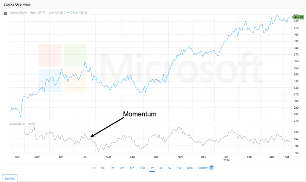
Momentum in trading refers to the speed and persistence of price movement – essentially, the rate of change in an asset’s price over a specific period. It measures the strength and acceleration behind price moves, helping traders identify overbought/oversold conditions, potential reversals, and trend continuations.
Core Concept:
Physics Analogy: Like a rolling ball, market momentum reflects how hard it is to stop a price trend. Strong momentum suggests continuation; fading momentum warns of exhaustion.
Key Insight: Momentum often leads price. Changes in momentum (acceleration/deceleration) can signal future price reversals before they appear on the price chart.
How Momentum is Measured:
Momentum indicators generally fall into two categories:
1. Price-Based Momentum Oscillators
These calculate momentum directly from price changes, oscillating around a midline (e.g., 0 or 50).
Momentum (Price ROC):
Current Close / Close N Periods Ago × 100
Example: Closing price today = $120, 10 days ago = $100 → Momentum(10) = 120.
Interpretation:
Values > 100 = Upward momentum (price higher than N periods ago).
Values < 100 = Downward momentum (price lower than N periods ago).
Often normalized to oscillate around 100 instead of 0.
Relative Strength Index (RSI):
Measures speed of price changes and overbought/oversold levels (0–100 scale).
RSI = 100 – [100 / (1 + RS)]
RS = Avg Gain / Avg Loss over N periods (typically 14)
Interpretation:
>70: Overbought (potential pullback).
<30: Oversold (potential bounce).
Divergences: Price makes new high/low, but RSI does not → Weak momentum, reversal likely.
Stochastic Oscillator:
Compares current close to its price range over N periods.
text
%K = [(Current Close – Lowest Low) / (Highest High – Lowest Low)] × 100
%D = 3-period SMA of %K (signal line)
Interpretation:
>80: Overbought.
<20: Oversold.
Crossovers: %K crossing above/below %D signals momentum shifts.
2. Moving Average-Based Oscillators
These track the relationship between moving averages to gauge trend acceleration.
Moving Average Convergence Divergence (MACD):
Measures the spread between two EMAs typically 12 & 26 periods).
MACD Line = (12-period EMA – 26-period EMA)
Signal Line = 9-period EMA of MACD Line
Histogram = MACD Line – Signal Line
Interpretation:
Zero-line cross: Bullish (MACD > 0) / Bearish (MACD < 0) momentum.
Signal-line cross: Buy/sell trigger.
Histogram height: Momentum strength (taller bars = stronger acceleration).
Rate of Change (ROC) with Moving Averages:
Applies a moving average to raw momentum to smooth noise.
ROC(MA) = [MA(Close, N) / MA(Close, N) from M periods ago] × 100
Example: Compare a 10-day SMA today vs. 3 days ago.
Why Momentum Matters:
Early Reversal Signals:
Divergence: Price makes a new high, but momentum fails to confirm → Weakness.
Bullish/Bearish Reversals: RSI/Stochastic exiting oversold/overbought zones.
Trend Confirmation:
Strong trends show persistent momentum above/below key levels (e.g., MACD > 0).
Overextended Markets:
Overbought/oversold readings warn of exhaustion (e.g., RSI >80 in uptrend).
Breakout Validation:
Rising momentum on a breakout suggests conviction; fading momentum hints at a fakeout.
Key Nuances:
Time Sensitivity: Shorter periods (e.g., RSI-7) react faster but generate more false signals.
Trend Context: Momentum signals work best when aligned with the trend (e.g., buy RSI dips in uptrends).
Volatility Adjustment: High volatility (e.g., during news) can distort readings. Combine with ATR for context.
No Directional Bias: Momentum measures speed, not direction. Use with trend indicators (e.g., moving averages).
Practical Example:
Scenario: Stock rises from $50 → $70 in 10 days.
Raw Momentum(10): 70 / 50 × 100 = 140 (strong upward acceleration).
RSI(14): Sustained above 70 → Overbought but trend-confirming.
MACD: Histogram rising → Momentum increasing.
Reversal Warning: Price hits $75, but Momentum(10) = 130 (lower than 140) → Bearish divergence.
Momentum vs. VHF/ATR:
Concept Momentum VHF ATR
Measures Speed of price change Trend efficiency Volatility magnitude
Key Use Reversals, exhaustion Trending vs. ranging Stop-losses, breakouts
Output Oscillator (RSI, MACD, etc.) Ratio (0-1+) Absolute price units ($)
Direction Implicit (via oscillator) Agnostic Agnostic
In summary, momentum is the market’s accelerator pedal. It quantifies how aggressively prices are moving and when that force is fading – essential for timing entries/exits and avoiding chasing exhausted moves. Pair it with trend (VHF) and volatility (ATR) tools for a complete technical framework.
Percent Range of Change (ROC)
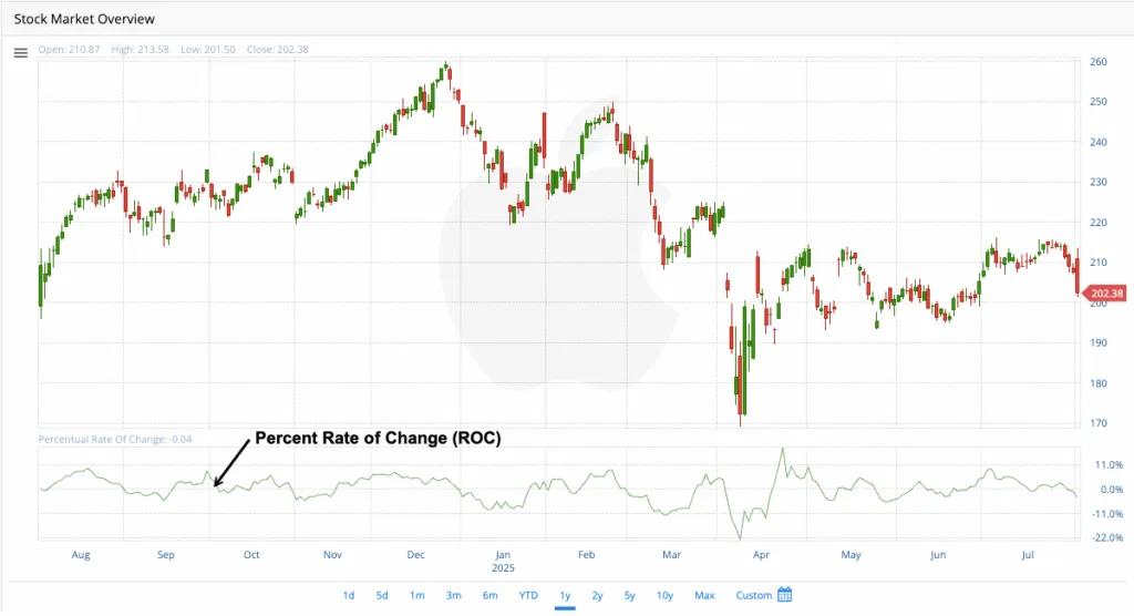
The Price Rate of Change (ROC) indicator is a technical analysis tool that measures the momentum of a security’s price. It calculates the percentage change in price between the current closing price and the closing price from a specific number of periods ago. This allows traders to assess the speed and direction of price movements.
Here’s a breakdown of its components:
– **Current Closing Price:** The most recent closing price of the security.
– **Closing Price n Periods Ago:** The closing price of the security a specified number of periods (n) in the past. The value of “n” is determined by the trader and can vary based on their trading style and analysis goals. Common periods include 10, 14, or 21 days for short-term analysis.
**Example:** If the current closing price of a stock is $50 and the closing price five periods ago was $40, the ROC calculation would be 25%. This 25% result indicates a price increase over the specified period.
### Interpretation
The ROC indicator fluctuates around a zero line.
– A **positive ROC** suggests an upward trend and bullish momentum, with higher values indicating stronger momentum.
– A **negative ROC** indicates a downward trend and bearish momentum, with lower values showing a stronger decline.
When the ROC is at zero, it signifies no price change, which often occurs in consolidating markets. The ROC indicator can help identify trends, their strengths, and potential overbought or oversold conditions.
High positive readings may indicate an overbought market, while very low negative readings might suggest an oversold market. However, the determination of these conditions depends on the volatility of the security, as there are no fixed levels.
### Additional Considerations
Divergence between the ROC and price action can signal potential trend reversals. For example, if the price makes higher highs but the ROC makes lower highs, it could indicate a bearish reversal.
Crossovers of the zero line can also signal potential entry or exit points, but these signals should be confirmed with other technical tools to avoid false trades.
While the ROC indicator is a valuable momentum tool, it should not be used in isolation. Combining it with other indicators, such as moving averages, support/resistance levels, and volume analysis, can enhance trading accuracy.
In the chart example, the percent rate of change is -0.04.
Performance
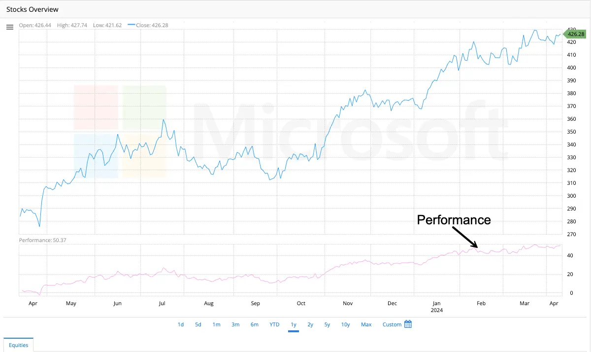
Performance is a measure that indicates the percentage change in a security’s price over time. It is commonly used for comparing different securities or to assess performance against a benchmark.
1. **Comparing the Relative Performance of Different Securities**:
Normalization: The percentage change normalizes price movements, allowing for comparisons even when securities have distinct initial prices.
Example: Consider a stock that increased from $10 to $12 (a 20% gain) compared to another stock that rose from $100 to $105 (a 5% gain).
2. **Evaluating a Security’s Performance Against a Benchmark**:
Benchmarking: An appropriate market index, such as the S&P 500 for large-cap US stocks, serves as a benchmark to determine whether a security is outperforming, underperforming, or matching the broader market or its specific segment.
Contextualization: A 10% gain might appear positive, but when compared to the S&P 500’s 15% gain over the same period, it indicates underperformance.
3. **Assessing Investment Strategies and Making Informed Decisions**:
Strategy Evaluation: Percentage change assists investors in determining the effectiveness of their investment strategies in generating expected returns.
Risk-Adjusted Returns: Investors often analyze percentage changes alongside risk metrics, such as standard deviation, to understand risk-adjusted returns and make informed decisions.
4. **Tracking Progress and Monitoring Security Performance Over Time**:
Trend Identification: Monitoring percentage changes over various periods (daily, weekly, monthly, annually) helps identify trends in a security’s performance.
Performance Monitoring: Continuously tracking percentage changes allows for timely adjustments to investment strategies and improved risk management.
In summary, measuring a security’s performance as a percentage change serves as a powerful and versatile tool for investors to analyze, compare, evaluate, and monitor their investments. This ultimately leads to more informed and effective decision-making.
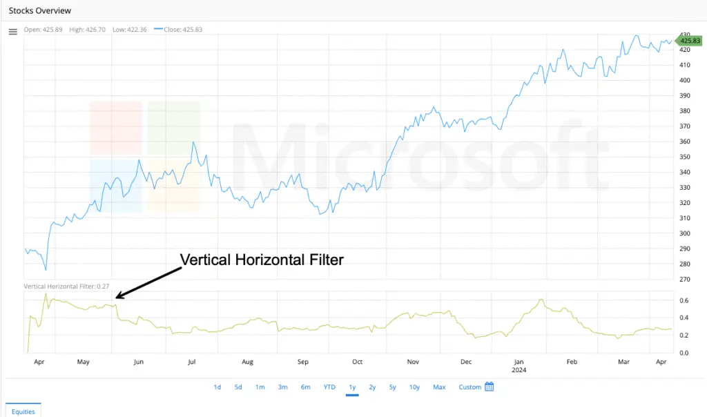
Vertical Horizontal Filter (VHF)
The Vertical Horizontal Filter (VHF) is a technical indicator developed by Adam White to help traders distinguish between trending and non-trending (congested, sideways) market conditions. Its core purpose is to quantify the strength of a trend (either up or down) relative to random price movement.
Here’s a breakdown of its description and measurement:
Purpose & What it Tells You:
High VHF Values (Approaching 1.0): Indicate a strong, well-defined trend is present. Prices are consistently making higher highs (uptrend) or lower lows (downtrend) over the look back period.
Low VHF Values (Approaching 0.0): Indicate a non-trending, choppy, or sideways market. Prices are oscillating without making significant progress in either direction.
VHF measures the “efficiency” of the price movement. A high VHF means the net price change (vertical movement) is large compared to the total wiggling back and forth (horizontal movement). A low VHF means the net movement is small relative to the total choppiness.
How it’s Measured (The Formula):
The VHF is calculated over a specific look back period (commonly 28 periods, but adjustable). Here’s the step-by-step process:
Identify the Highest and Lowest Closes:
HIGHEST CLOSE (HCP) = The highest closing price within the look back period.
LOWEST CLOSE (LCP) = The lowest closing price within the look back period.
VERTICAL MOVEMENT (VM) = HCP – LCP
Calculate the Sum of Absolute Price Changes:
For each period (i) within the look back period, calculate the absolute value of the difference between the current close (Close_i) and the previous close (Close_i-1).
HORIZONTAL MOVEMENT (HM) = Σ | Close_i – Close_i-1 | (Summed over the entire look back period).
This represents the total “wiggle” or volatility, regardless of direction.
Compute the VHF:
VHF = VM / HM
VHF = (HCP – LCP) / Σ | Close_i – Close_i-1 |
Interpretation of the Values:
0.0 to ~0.25/0.30: Generally indicates a weak or non-existent trend (sideways market). Trading range-bound strategies might be more appropriate.
~0.30/0.35 to 0.40/0.45: A moderate or developing trend. Use with caution; confirm with other indicators.
Above ~0.40/0.45 to 1.0: Indicates a strong trend. Trend-following strategies are more likely to be successful.
Important Note: The exact thresholds (0.30, 0.40, etc.) are not absolute rules. Traders often:
Look for the direction of the VHF (rising or falling).
Use moving averages of the VHF to smooth it and identify shifts.
Compare the current VHF to its own historical values for that specific asset to find relevant levels.
Key Characteristics:
Non-Directional: VHF only measures the strength of the trend, not its direction (up or down). You need price action or other indicators to determine direction.
Range-Bound: The value will always be between 0.0 and 1.0.
Look back Period Dependent: The value is highly sensitive to the chosen look back period. A shorter period will be more volatile and react faster, potentially giving false signals. A longer period will be smoother but lag more.
Lagging Indicator: Like most technical indicators, it’s based on past prices and inherently lags.
Practical Use in Trading:
Trend Confirmation: Use a rising VHF (especially above your chosen threshold) to confirm that a price breakout is likely part of a genuine trend, not just noise.
Strategy Selection: Switch between trend-following strategies (moving averages, MACD) when VHF is high and range-trading strategies (RSI near extremes, support/resistance) when VHF is low.
Filtering Trades: Avoid taking trend-following signals when VHF is very low, as they are more likely to fail in a choppy market.
Identifying Trend Exhaustion: A consistently high VHF that starts to decline while price action also weakens can signal a potential trend exhaustion or reversal into consolidation.
In summary: The VHF is a valuable tool for objectively measuring whether the market is in a state where trends are likely to persist (high VHF) or where choppy, range-bound conditions dominate (low VHF). It’s measured by calculating the net vertical price movement over a period divided by the total absolute horizontal price movement during that same period.
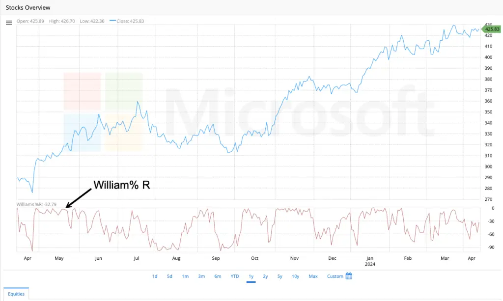
William %R
The Williams %R (pronounced “percent R”) is a momentum oscillator developed by Larry Williams to identify overbought and oversold conditions in the market. Unlike the VHF (which measures trend strength), %R focuses purely on the current closing price’s position relative to the highest high and lowest low over a specific look back period.
Here’s a breakdown of its description and measurement:
Purpose & What it Tells You:
Measures Momentum: It gauges the speed and change of price movements.
Identifies Extremes:
Oversold: When %R is near its lower extreme (typically -80 to -100), it suggests selling pressure may be exhausted, and the price might be due for a bounce upwards.
Overbought: When %R is near its upper extreme (typically 0 to -20), it suggests buying pressure may be exhausted, and the price might be due for a pullback downwards.
Divergence: Bullish divergence (price makes lower lows, %R makes higher lows) or bearish divergence (price makes higher highs, %R makes lower highs) can signal potential trend weakness and reversal points.
Centerline Crosses: While less common, crossing the -50 level can sometimes be used as a weak signal of shifting momentum.
Key Characteristic: The Inverted Scale
This is crucial! Williams %R is plotted on an inverted scale between 0 and -100.
High Readings (near 0): Indicate the close is near the HIGH of the look back range. This is interpreted as Overbought.
Low Readings (near -100): Indicate the close is near the LOW of the look back range. This is interpreted as Oversold.
How it’s Measured (The Formula):
The %R is calculated over a specific look back period (commonly 14 periods, but adjustable). The formula is:
%R = [(Highest High (over N periods) – Current Close) / (Highest High (over N periods) – Lowest Low (over N periods))] * -100
Where:
Highest High (HH) = The highest price (not just close) reached during the last N periods.
Lowest Low (LL) = The lowest price (not just close) reached during the last N periods.
Current Close = The closing price of the current period.
N = The look back period (e.g., 14 days).
* -100 = This transforms the result into the inverted 0 to -100 scale.
Step-by-Step Interpretation of the Formula:
Find the Range: (HH – LL) = The total price range over the last N periods.
Measure Position from the Top: (HH – Close) = How far the current close is below the highest high in the period.
Calculate the Ratio: (HH – Close) / (HH – LL) = This ratio represents where the close sits within the recent range.
If the close is very near the HH, this ratio is small (close to 0).
If the close is very near the LL, this ratio is large (close to 1).
Invert and Scale: Multiplying by -100 flips the sign and scales it:
A small ratio (close near HH) becomes a number near 0.
A large ratio (close near LL) becomes a number near -100.
Practical Interpretation & Use:
Overbought Zone (0 to -20): Considered a potential selling opportunity or warning against new long positions, especially if other indicators confirm. However, in strong uptrends, prices can remain overbought for extended periods.
Oversold Zone (-80 to -100): Considered a potential buying opportunity or warning against new short positions, especially if other indicators confirm. However, in strong downtrends, prices can remain oversold for extended periods.
Signal Confirmation is Key: %R signals are most reliable when:
Used in conjunction with trend analysis (e.g., VHF, moving averages). Trading oversold signals in a downtrend or overbought signals in an uptrend is risky.
Divergence occurs between price and the oscillator.
The indicator exits the overbought or oversold zone (e.g., falls back below -20 after being overbought, or rises above -80 after being oversold).
Used alongside other indicators like volume, support/resistance, or chart patterns.
Key Characteristics:
Range-Bound Oscillator: Always oscillates between 0 and -100.
Momentum Focused: Measures the velocity of price changes relative to recent extremes.
Sensitive to look back Period (N): Shorter periods make it more volatile and reactive but prone to false signals. Longer periods make it smoother but slower to react.
Best in Ranging Markets: Tends to generate better signals when the underlying asset is trading sideways rather than in a strong trend.
Similar to Stochastic: It’s very similar to the Fast Stochastic Oscillator (%K), but %R is plotted on an inverted scale (0 to -100 vs. 0 to 100 for Stochastic) and uses slightly different smoothing in its standard forms.
In summary: The Williams %R is a momentum oscillator that identifies potential overbought (readings near 0) and oversold (readings near -100) conditions by plotting the current closing price’s position within the highest-high to lowest-low range of a specified lookback period. Its inverted scale is essential to remember for correct interpretation. It’s calculated as: %R = [(HH – Close) / (HH – LL)] * -100.
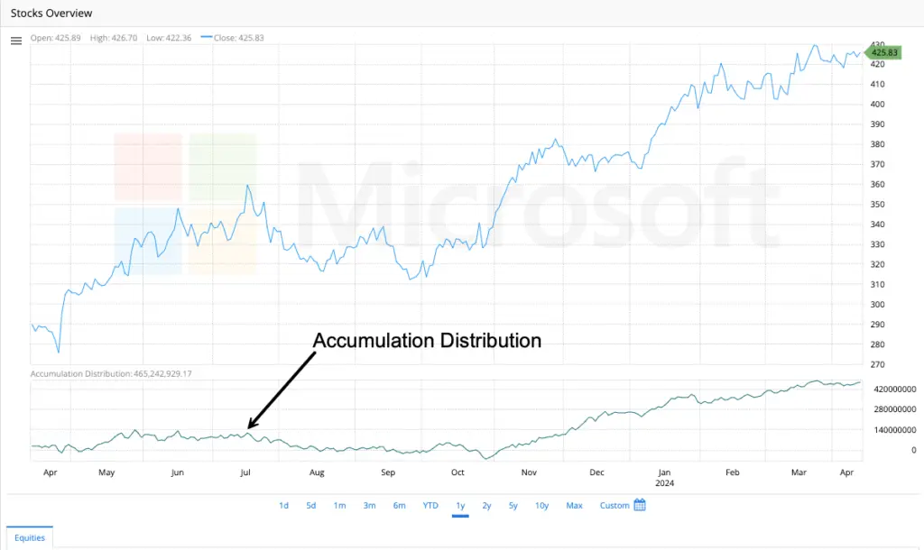
Accumulation/Distribution Line
The Accumulation/Distribution Line (A/D Line) is a volume-based indicator developed by Marc Chaikin. It measures the cumulative flow of money into or out of a security by analyzing both price movement and trading volume. Unlike price-only oscillators, the A/D Line helps confirm trends or warn of potential reversals by revealing whether volume supports the price action.
Key Purposes & What It Tells You:
Identify Buying/Selling Pressure:
Rising A/D Line: Indicates accumulation (buying pressure). Volume confirms upward price moves.
Falling A/D Line: Indicates distribution (selling pressure). Volume confirms downward price moves.
Confirm Trend Strength:
If the A/D Line moves in the same direction as the price, the trend is likely strong and sustainable.
Divergence between price and the A/D Line signals weakness in the trend.
Spot Potential Reversals:
Bullish Divergence: Price makes lower lows, but the A/D Line makes higher lows. Suggests underlying buying pressure.
Bearish Divergence: Price makes higher highs, but the A/D Line makes lower highs. Suggests underlying selling pressure.
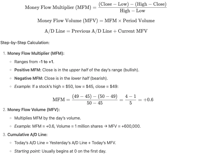
How It’s Measured (The Formula):
The A/D Line is cumulative, meaning each period’s value is added to the previous total. The core component is the Money Flow Multiplier, which positions the closing price within the day’s range:
Key Characteristics:
Volume-Weighted: Unlike price-only indicators, volume gives it credibility.
Cumulative: Trends in the A/D Line matter more than single-day values.
Leading vs. Lagging: Can act as a leading indicator when showing divergence (warning of reversals) but is lagging during strong trends.
Works Best with Trends: Most effective alongside trend analysis (e.g., moving averages).
Not Bound to Price Scale: Focus on its direction and divergence, not absolute values.
Comparison to Similar Indicators:
vs. On-Balance Volume (OBV):
OBV adds/subtracts all volume based on price direction (close > prior close = +volume).
A/D Line uses the intraday range (MFM), making it more sensitive to price positioning.
vs. Volume-Price Trend (VPT):
VPT uses percentage price changes, while A/D uses the daily range.
Practical Example:
Stock: XYZ rallies from $100 to $120, but the A/D Line starts declining.
Interpretation: The rally lacks volume conviction → distribution is occurring → reversal likely.
Action: Reduce long exposure or hedge.
In summary: The A/D Line reveals whether volume confirms price trends or warns of reversals through divergence. By tracking cumulative money flow, it helps traders distinguish between strong trends and unsustainable moves. Always combine it with price analysis for best results!
| Scenario | What It Means | Trading Insight |
|---|---|---|
| A/D Line ↗ + Price ↗ | Strong uptrend backed by volume (accumulation). | Confirms bullish trend; hold or add to positions. |
| A/D Line ↘ + Price ↘ | Strong downtrend backed by volume (distribution). | Confirms bearish trend; avoid longs or consider shorts. |
| Price ↗ but A/D Line →/↘ | Bearish Divergence: Weak volume support. Trend may reverse. | Warns of potential pullback; tighten stops or take profits. |
| Price ↘ but A/D Line →/↗ | Bullish Divergence: Selling pressure fading; accumulation may be starting. | Watch for reversal signals (e.g., breakouts); consider long entries. |
| A/D Line Flat | Indecision; volume doesn’t confirm price moves. | Sideways market; avoid trend-based strategies. |
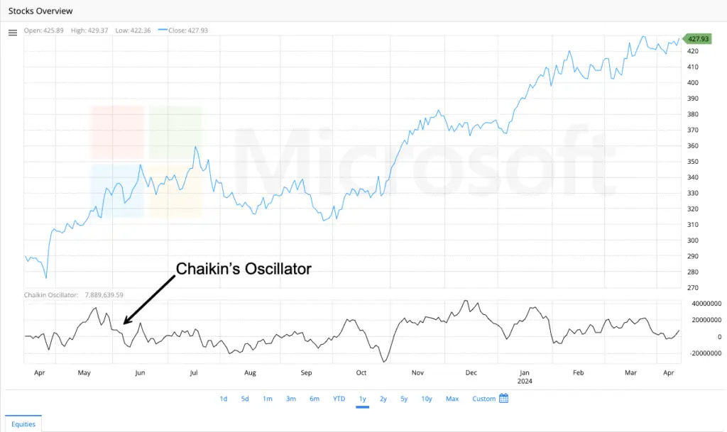
Chaikin Oscillator
The Chaikin Oscillator (also called the Chaikin Money Flow Oscillator) is a momentum indicator derived from the Accumulation/Distribution Line (A/D Line). Developed by Marc Chaikin, it measures the momentum of money flow into or out of a security by comparing short-term and long-term moving averages of the A/D Line. Its primary purpose is to generate earlier signals and identify divergences more clearly than the raw A/D Line.
Key Purposes & What It Tells You
Confirm Trend Strength:
Positive values: Indicate accumulation (buying pressure).
Negative values: Indicate distribution (selling pressure).
Spot Divergences:
Bullish divergence: Price makes lower lows while the oscillator makes higher lows (potential reversal up).
Bearish divergence: Price makes higher highs while the oscillator makes lower highs (potential reversal down).
Identify Overbought/Oversold Conditions:
Extreme highs (e.g., > +0.05–0.10) suggest overbought conditions.
Extreme lows (e.g., < -0.05–0.10) suggest oversold conditions.
Generate Trade Signals:
Crosses above/below the zero line signal shifts in momentum.
Crosses of the signal line (like MACD) offer entry/exit cues.
How It’s Calculated
The Chaikin Oscillator is the difference between two Exponential Moving Averages (EMAs) of the A/D Line:
Chaikin Oscillator = (3-day EMA of A/D Line) - (10-day EMA of A/D Line)
(Default periods are 3 and 10 days, but traders can adjust these).
Step-by-Step:
Calculate the A/D Line (as previously described).
Compute the 3-day EMA of the A/D Line.
Compute the 10-day EMA of the A/D Line.
Subtract the 10-day EMA from the 3-day EMA.
Interpretation & Trading Signals
| Scenario | Meaning | Action |
|---|---|---|
| Crosses ABOVE Zero Line | Short-term money flow momentum turns positive. | Bullish signal → Consider longs or adding to positions. |
| Crosses BELOW Zero Line | Short-term money flow momentum turns negative. | Bearish signal → Consider shorts or reducing exposure. |
| Bullish Divergence | Price ↓ but Oscillator ↑ (buying pressure building). | Potential reversal up → Watch for confirmation (e.g., breakout). |
| Bearish Divergence | Price ↑ but Oscillator ↓ (selling pressure building). | Potential reversal down → Tighten stops or take profits. |
| Extreme Highs (> +0.10) | Overbought with aggressive buying. | Risk of pullback → Avoid new longs. |
| Extreme Lows (< -0.10) | Oversold with aggressive selling. | Risk of bounce → Avoid new shorts. |
Why Use It vs. the Raw A/D Line?
Smooths Noise: EMAs filter out short-term fluctuations in the A/D Line.
Faster Signals: Reacts quicker to shifts in volume momentum.
Clearer Divergences: Amplifies discrepancies between price and money flow.
Zero-Line Crosses: Provides unambiguous momentum thresholds.
Practical Example
Stock ABC:
Price rallies to new highs, but the Chaikin Oscillator declines and crosses below zero.
Interpretation: Distribution is occurring despite price strength → Bearish reversal likely.
Action: Sell longs or initiate short positions.
Key Tips for Traders
Combine with Price Trends:
Use in uptrends to buy dips when the oscillator crosses above zero.
Use in downtrends to short rallies when it crosses below zero.
Pair with A/D Line: Confirm oscillator signals with the direction of the A/D Line.
Avoid Choppy Markets: Works best in trending environments (use VHF or ADX to confirm trends).
Adjust Periods: For day trading, shorten EMAs (e.g., 2/8 periods); for investing, lengthen (e.g., 5/20).
Comparison to MACD
Similarity: Both use EMA crossovers to capture momentum shifts.
Difference:
MACD: Tracks price momentum (EMA of prices).
Chaikin Oscillator: Tracks volume momentum (EMA of A/D Line).
In summary, the Chaikin Oscillator refines the A/D Line into a tactical tool, spotlighting shifts in buying/selling pressure faster and more clearly. Its zero-line crosses, divergences, and extremes make it invaluable for confirming trends or anticipating reversals—always use it alongside price action and volume analysis.
Ease of Movement (EMV)
The Ease of Movement (EMV) is a momentum oscillator that measures the relationship between a stock’s price change and its trading volume. Its core purpose is to quantify how easily a price is moving up or down.
The genius of the EMV is in its name:
- “Ease” of Movement: A high positive EMV value suggests that a stock’s price is rising with relative ease—that is, on relatively low volume. This indicates strong buying pressure with little resistance.
- “Difficulty” of Movement: A low negative EMV value suggests that a stock’s price is falling with relative ease—again, on low volume. This indicates strong selling pressure.
- “Hard” Movement: When the EMV hovers around zero, it signals that the price is struggling to make headway. It’s moving on high volume but not getting far, which often indicates a lack of conviction or a battle between buyers and sellers. This can be a sign of consolidation or a potential reversal point.
The Big Idea: The EMV helps you distinguish between meaningful, high-conviction price moves and sluggish, low-conviction ones. It filters out “noise” by emphasizing moves that happen without much volume struggle.
How is the Ease of Movement Measured?
The calculation for EMV might look a bit math-heavy at first, but it’s built on a very logical intuition. Let’s break it down step-by-step.
The formula for the single-period EMV is:
Ease of Movement = [ (Current High + Current Low)/2 – (Previous High + Previous Low)/2 ] / [ (Volume / 100,000,000) / (Current High – Current Low) ]
Don’t worry, we’ll dissect this:
Step 1: Calculate the Midpoint Move.
This is the numerator (the top part of the fraction):
(Current High + Current Low)/2 – (Previous High + Previous Low)/2
- First, you find the average price (the midpoint) for both the current period and the previous period.
- Then, you subtract the previous midpoint from the current one. This gives you the raw price change between the two periods.
Step 2: Calculate the Volume-Powered “Box Ratio”.
This is the denominator (the bottom part of the fraction):
(Volume / 100,000,000) / (Current High – Current Low)
- (Current High – Current Low) is the day’s trading range. A small range with high volume means the price met a lot of resistance to move.
- To scale the volume for different priced stocks, it’s divided by 100,000,000 (an arbitrary scaling constant set by the inventor, Richard Arms).
- This whole term is often called the “Box Ratio.” A high Box Ratio (high volume, small range) means the price had to work hard to move. A low Box Ratio (low volume, wide range) means the price moved easily.
The Final Calculation:
You then divide the Midpoint Move (Step 1) by the Box Ratio (Step 2).
The Logic: You’re essentially asking, “How much did the price change (midpoint move) relative to the effort (volume/range) it took to achieve that change?”
Putting It Into Practice: The 14-Period SMA
A single day’s EMV value is very volatile and noisy. To make it useful for analysis, technicians almost always smooth it out by taking a 14-period Simple Moving Average (SMA) of the raw EMV values.
This smoothed line is what you typically see plotted on charts, oscillating above and below a zero line.
- Positive EMV (above zero): Suggests the price is moving upward with ease.
- Negative EMV (below zero): Suggests the price is moving downward with ease.
- EMV Crosses Zero: A cross above zero can be a bullish signal, while a cross below zero can be a bearish signal.
- Divergence: If the stock price is making new highs but the EMV is failing to make new highs (bearish divergence), it suggests the upward move is losing steam and becoming more difficult. The opposite is true for bullish divergence.
A Simple Example:
Let’s say a stock today has:
- High: $51
- Low: $49
- Volume: 1,000,000 shares
Yesterday it had:
- High: $50
- Low: $49
1. Midpoint Move: (51+49)/2 – (50+49)/2 = (50 – 49.5) = +0.5
2. Box Ratio: (1,000,000 / 100,000,000) / (51 – 49) = (0.01) / (2) = 0.005
3. Raw EMV: 0.5 / 0.005 = +100
A value of +100 indicates very easy upward movement. The price rose a decent amount ($0.50 midpoint) on a low volume-to-range ratio.
Key Takeaways:
- Volume + Range: EMV is unique because it combines both volume and price range into one indicator.
- Identify “Easy” Moves: Use it to spot stocks trending smoothly and with conviction, and to avoid those that are choppy and struggling to move.
- Confirmation, Not a Crystal Ball: Like all indicators, the EMV is best used alongside other tools, like trend lines or support/resistance levels, to confirm signals.
- Mind the Settings: The standard 14-period SMA is a great starting point, but feel free to experiment with the time period to fit the stock’s volatility and your trading style.
- While most platforms default to a 14-period Simple Moving Average (SMA) to smooth the EMV data, don’t be afraid to experiment. If you’re a position trader focused on the longer-term trend, sticking with the SMA might be best. If you’re a active swing trader, try applying a 14-period Exponential Moving Average (EMA) instead. The EMA will be more sensitive and may provide earlier signals, but always confirm these signals with other aspects of your analysis, as they can be less reliable.
SMA vs. EMA for EMV: A Quick Comparison
Feature | Simple Moving Average (SMA) | Exponential Moving Average (EMA) |
Weighting | Equal weight to all periods in the window. | More weight given to recent periods. |
Responsiveness | Slower, smoother. | Faster, more reactive. |
Signals | Later, but often more reliable for the overall trend. | Earlier, but can be prone to false signals. |
Best For | Identifying the predominant trend of ease/difficulty. Spotting clear divergences. | Short-term trading where timely signals are critical. |
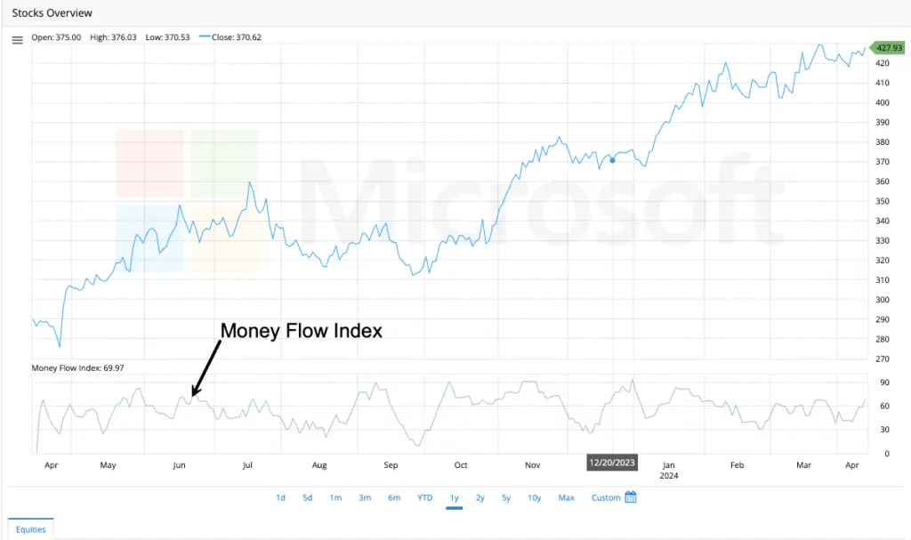
Money Flow Index (MFI)
The Money Flow Index (MFI) is a momentum oscillator that measures the buying and selling pressure by analyzing both price and volume data. It oscillates between 0 and 100.
By comparing the volume associated with “up days” to the volume associated with “down days,” the MFI provides insight into whether the market is accumulating (buying) or distributing (selling) a stock. This makes it exceptionally good at identifying potential reversals and confirming the strength of a trend.
How is the Money Flow Index Measured?
The calculation for MFI is a multi-step process. Don’t worry—we’ll break it down logically. The standard look-back period is 14 periods (e.g., 14 days for daily charts).
Step 1: Calculate the Typical Price
The Typical Price is the average of the high, low, and closing price for the period.
Typical Price = (High + Low + Close) / 3
Step 2: Calculate the Raw Money Flow
This is the Typical Price multiplied by the volume for that period.
Raw Money Flow = Typical Price × Volume
Step 3: Identify Positive and Negative Money Flow
- Compare today’s Typical Price to yesterday’s Typical Price.
- If today’s Typical Price > yesterday’s Typical Price, it’s an “up day.” That day’s Raw Money Flow is considered Positive Money Flow.
- If today’s Typical Price < yesterday’s Typical Price, it’s a “down day.” That day’s Raw Money Flow is considered Negative Money Flow.
- (If the price is unchanged, the Money Flow for that day is ignored.)
Step 4: Sum the Money Flows Over the Period (Usually 14 days)
- Total Positive Money Flow: The sum of all Positive Money Flow over the last 14 periods.
- Total Negative Money Flow: The sum of all Negative Money Flow over the last 14 periods.
Step 5: Calculate the Money Flow Ratio (MFR)
Money Flow Ratio = Total Positive Money Flow / Total Negative Money Flow
Step 6: Calculate the Money Flow Index
Finally, plug the Money Flow Ratio into the following formula:
MFI = 100 – [100 / (1 + Money Flow Ratio)]
This final step is identical to the RSI calculation, which is why the MFI behaves so similarly but with the added dimension of volume.
How is the Money Flow Index Used?
Traders use the MFI in three primary ways:
1. Identifying Overbought and Oversold Conditions
This is the most common use. The MFI ranges from 0 to 100.
- Overbought: Readings above 80 suggest the asset may be overbought and could be due for a pullback or reversal to the downside.
- Oversold: Readings below 20 suggest the asset may be oversold and could be due for a bounce or reversal to the upside.
Important Note: In a strong trending market, the MFI can remain in overbought or oversold territory for extended periods. It’s crucial to use these levels as alert zones, not automatic buy/sell signals.
2. Spotting Divergences
This is often considered the most powerful signal generated by the MFI.
- Bearish Divergence: The price makes a new high, but the MFI makes a lower high. This indicates that the price is rising, but the volume-powered momentum is waning. It suggests weak buying pressure and a potential upcoming reversal downward.
- Bullish Divergence: The price makes a new low, but the MFI makes a higher low. This indicates that the price is falling, but selling pressure is diminishing. It suggests accumulation and a potential upcoming reversal upward.
3. Recognizing Failure Swings
These are reversal patterns that occur within the MFI itself, independent of price.
- Bullish Failure Swing: The MFI falls below 20 (oversold), rallies back above 20, pulls back but holds above 20, and then breaks its previous rally high. This is a strong internal momentum buy signal.
- Bearish Failure Swing: The MFI rallies above 80 (overbought), falls back below 80, rallies again but stays below 80, and then breaks its previous pullback low. This is a strong internal momentum sell signal.
A Simple Example:
Let’s say over a 14-day period:
- The sum of all Positive Money Flow (from up days) = ͏2,500,000
- The sum of all Negative Money Flow (from down days) = ͏1,500,000
Money Flow Ratio = 2,500,000 / 1,500,000 = 1.6667
MFI = 100 – [100 / (1 + 1.6667)]
= 100 – [100 / 2.6667]
= 100 – 37.5
= 62.5
A MFI of 62.5 suggests moderate buying pressure but is not in overbought or oversold territory.
Key Takeaways:
- The RSI with Volume: The MFI is best understood as a volume-weighted RSI, making its signals often more robust.
- Volume is Key: Because it uses volume, the MFI is better at spotting exhaustion moves and potential reversals than pure price oscillators.
- Confirmation is Crucial: Never rely on the MFI alone. Use it in conjunction with trend analysis, support/resistance levels, and other indicators to confirm signals.
- Divergences are Powerful: Pay close attention to divergences between price and the MFI, as they can often foreshadow significant trend changes.
By adding the Money Flow Index to your analysis, you move beyond just what the price is doing and start to understand how it’s moving—specifically, the force of the buying and selling pressure behind the move. This provides a much deeper insight into market sentiment.
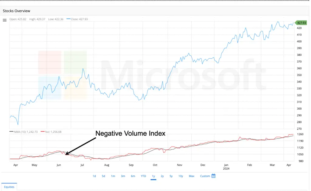
Negative Value Index (NFI)
The Negative Volume Index (NVI) is a cumulative indicator that aims to identify what informed, institutional investors (“smart money”) are doing by focusing solely on periods when volume decreases from the previous day.
The core logic, popularized by analyst Norman Fosback, is this:
- High Volume Days: are driven by the uninformed crowd (“noise” and emotional reactions).
- Low Volume Days: are where sophisticated, knowledgeable investors make their moves quietly, confident in their research without the pressure of the herd.
Therefore, the NVI only changes its value on days when volume is lower than the previous day. By tracking price changes only on these days, the NVI attempts to reveal the underlying trend being set by the smart money.
How is the Negative Volume Index Measured?
The calculation for NVI is cumulative, meaning today’s value is based on yesterday’s value. It starts from an arbitrary base point (e.g., 1000). The rules are simple:
On a day where today’s volume is LOWER than yesterday’s volume:
NVI = Previous NVI + [ (Today’s Close – Yesterday’s Close) / Yesterday’s Close ) * Previous NVI ]
On a day where today’s volume is HIGHER than yesterday’s volume:
NVI = Previous NVI (i.e., the value remains unchanged)
Let’s break down the formula:
- It first calculates the percentage price change from the previous day: (Today’s Close – Yesterday’s Close) / Yesterday’s Close
- It then applies that percentage change to the previous NVI value and adds it on.
This means the NVI is essentially a cumulative line that only grows (or shrinks) based on the price action of low-volume days.
How is the Negative Volume Index Used?
The NVI is not used for short-term trading signals like overbought/oversold levels. Instead, its primary use is for identifying major bull market trends and confirming the overall health of a market advance.
1. The Primary Signal: The NVI Line Itself
- A rising NVI is a bullish sign. It indicates that on quiet, low-volume days, the price is still trending upward. This suggests sustained buying interest from informed investors even without public participation.
- A flat or falling NVI is a bearish sign. If the price can’t make headway on low volume, it indicates a lack of conviction from the smart money. They are not buying into the rallies.
2. The NVI and its 255-Day Moving Average
This is the most classic and powerful way to use the NVI, as defined by Fosback.
- Bullish Signal: When the NVI line crosses above its 255-day (one-year) moving average, it is a major long-term bullish signal, suggesting the smart money is confident and a significant upward trend is likely.
- Bearish Signal: When the NVI line crosses below its 255-day moving average, it is a major long-term bearish or cautionary signal.
3. Divergence Analysis
- If the market’s price is making new highs but the NVI is failing to make new highs (a bearish divergence), it suggests the rally is being driven by the uninformed public on high volume, not the smart money. This can be a warning of an weak and unsustainable advance.
- Conversely, if the market is flat or falling but the NVI is starting to trend higher, it can be an early, stealthy sign that smart money is accumulating positions.
A Simple Example:
Let’s assume the NVI started at 1,000.
- Day 1: Close = $100, Volume = 1M shares → NVI = 1000 (Starting point)
- Day 2: Close = $102, Volume = 1.2M shares → Volume is higher. NVI remains at 1000.
- Day 3: Close = $103, Volume = 0.9M shares → Volume is lower.
- Percentage Change = ($103 – $102) / $102 = 0.0098 (or 0.98%)
- New NVI = 1000 + (0.0098 * 1000) = 1009.8
The NVI increased because the price rose on lower volume.
Key Takeaways:
- Smart Money Tracker: The NVI is a long-term, “smart money” confidence indicator. It ignores the noise of the crowd.
- Trend Confirmation, Not Timing: It is excellent for confirming the strength of a bull market but is useless for short-term timing or identifying overbought/oversold conditions.
- The 255-Day MA is Key: For actionable signals, always plot the NVI alongside its 255-day moving average. The crosses are significant.
- The Perfect Partner: The PVI: The NVI is almost always used in conjunction with its counterpart, the Positive Volume Index (PVI), which tracks price action only on higher-volume days (the “crowd” behavior). Comparing the trends of the NVI and PVI can reveal fascinating dynamics between smart money and the general public.
By understanding the Negative Volume Index, your analysis moves beyond what is happening to who is making it happen. It provides a unique lens to see if the market’s trend has the solid, quiet support of informed investors or is just a noisy spectacle that may not last.
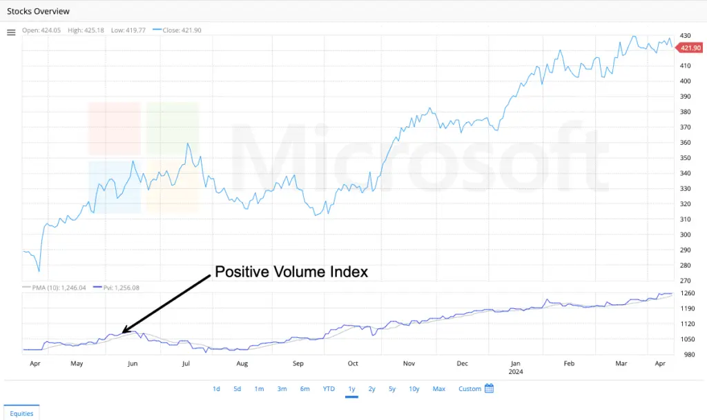
Positive Volume Index (PVI)
We covered the Negative Volume Index (NVI), which tracks the “smart money,” we now turn to its essential partner: the Positive Volume Index (PVI). If the NVI reveals the actions of informed investors on quiet days, the PVI exposes the behavior of the general public on days of high excitement.
What is the Positive Volume Index (PVI)?
The Positive Volume Index (PVI) is a cumulative indicator that focuses exclusively on periods when trading volume increases from the previous day. Its underlying assumption is the mirror image of the NVI’s logic:
High Volume Days (Today’s Volume > Yesterday’s Volume): are driven by the uninformed crowd, herd behavior, and emotional trading (panic selling or FOMO buying).
Low Volume Days: are ignored by the PVI.
Therefore, the PVI’s value only changes on days when volume is higher than the previous day. It aims to track the performance of the market during periods of high public participation, revealing trends fueled by mass sentiment.
How is the Positive Volume Index Measured?
The calculation for PVI is nearly identical to the NVI’s, but it is triggered by high volume instead of low volume. It is also cumulative and starts from an arbitrary base point (e.g., 1000).
On a day where today’s volume is HIGHER than yesterday’s volume:
PVI = Previous PVI + [ (Today’s Close – Yesterday’s Close) / Yesterday’s Close ) * Previous PVI ]
On a day where today’s volume is LOWER than yesterday’s volume:
PVI = Previous PVI (i.e., the value remains unchanged)
Breaking it down:
It calculates the percentage price change from the previous day.
It applies that percentage change to the previous PVI value only if volume increased.
This creates a cumulative line that only moves on high-volume days, charting the performance of the “crowd.”
How is the Positive Volume Index Used?
Norman Fosback’s original work suggested that the majority of the investing public is wrong at key market turning points. Therefore, the PVI is often used as a contrarian indicator.
1. The Primary Signal: The PVI Line and its 255-Day MA
A rising PVI suggests the crowd is actively buying and pushing prices up on high volume. In a strong bull market, this can persist.
However, a very high PVI relative to its own history can sometimes signal excessive public euphoria, a potential warning sign of a market top.
The most common interpretation is to use its 255-day moving average, just like the NVI.
A PVI above its 255-day MA generally indicates a bull market supported by public participation.
A PVI below its 255-day MA indicates a bear market where the crowd is actively selling.
2. The Power of Comparison: PVI vs. NVI
This is the most valuable and common way to use these indicators. By comparing the trends of the PVI and NVI, you can gauge who is driving the market: the smart money or the crowd.
NVI Rising Faster than PVI (NVI > PVI trend): This is a very bullish sign. It indicates that the informed investors are leading the market upward, and the trend is built on a solid, smart-money foundation. The crowd may join later, reinforcing the move.
PVI Rising Faster than NVI (PVI > NVI trend): This is a cautionary or bearish sign. It suggests the market advance is being driven primarily by the emotional public. This kind of rally can be powerful but is often considered fragile and vulnerable to a sharp reversal once the crowd’s enthusiasm wanes. It may indicate a “blow-off top.”
A Simple Example:
Let’s assume the PVI started at 1,000.
Day 1: Close = $50, Volume = 500k shares → PVI = 1000
Day 2: Close = $51, Volume = 800k shares → Volume is higher.
Percentage Change = ($51 – $50) / $50 = 0.02 (or 2%)
New PVI = 1000 + (0.02 * 1000) = 1020
Day 3: Close = $50.50, Volume = 400k shares → Volume is lower. PVI remains at 1020.
Day 4: Close = $52, Volume = 900k shares → Volume is higher.
Percentage Change = ($52 – $50.50) / $50.50 ≈ 0.0297 (or 2.97%)
New PVI = 1020 + (0.0297 * 1020) ≈ 1050.29
The PVI increases when the price moves on higher volume.
Key Takeaways:
Crowd Money Tracker: The PVI tracks the investment results of the general public on high-volume days.
Contrarian Lean: While it can trend with the market, extremely high PVI levels can signal overheated markets driven by crowd euphoria.
Never Use It Alone: The PVI’s true value is only realized when compared to the NVI. They are a tandem indicator.
Synergy is Key: The relationship between the NVI and PVI tells a story:
Healthy Bull Market: NVI leads the way up, and PVI follows. Smart money leads, the crowd confirms.
Unhealthy Bull Market (Toppy): PVI leads the way up, and NVI lags or diverges. The crowd is leading, and smart money is not participating.
Bear Market: Both trends are typically falling.
By adding the Positive Volume Index to your analysis, you complete the picture of market participation. You’re no longer just looking at price and volume separately; you’re analyzing the psychological battle between the informed institutional investors and the emotional crowd, giving you a profound edge in understanding market dynamics.
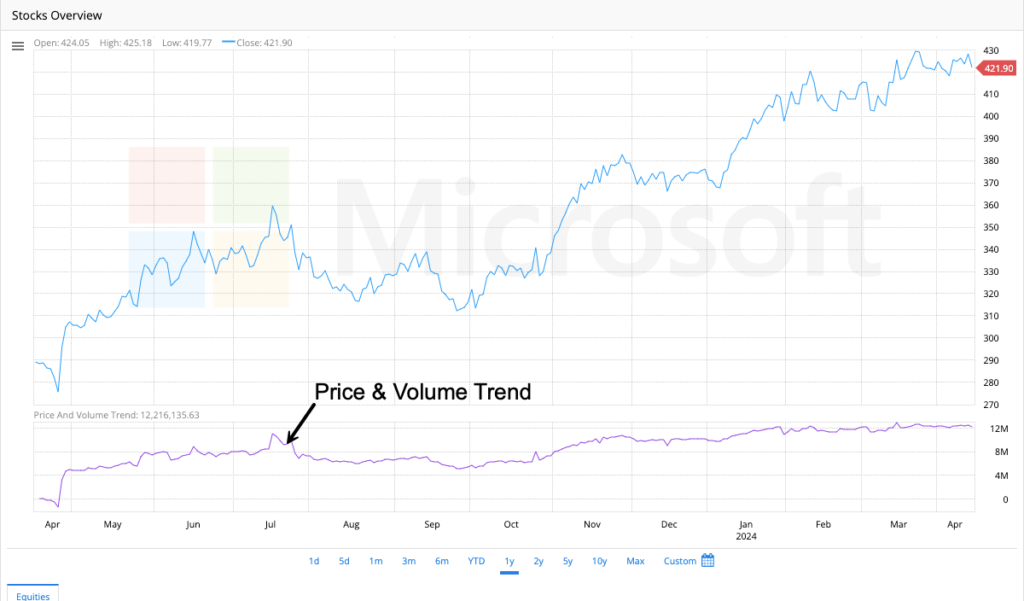
Price and Volume Trend (PVT)
Moving on in our series, we come to one of the most intuitive volume-based indicators: the Price and Volume Trend (PVT). Think of it as a more nuanced alternative to the classic On Balance Volume (OBV). It doesn’t just ask if volume is up or down, but how much price moved on that volume, giving a finer-grained view of money flow.
What is the Price and Volume Trend (PVT)?
The Price and Volume Trend (PVT) is a momentum oscillator that measures the relationship between a security’s price changes and its volume. It is a cumulative indicator, meaning it adds or subtracts a value each period to create a running total.
The core idea is simple: it assigns more weight to volume on days with large price moves and less weight to volume on days with small price moves. This makes it exceptionally good at confirming the strength of a price trend and spotting divergences that may foreshadow a reversal.
How is the Price and Volume Trend (PVT) Measured?
The calculation for PVT is straightforward and is done for each period (e.g., each day). The formula is:
PVT = [ ((Today’s Close – Yesterday’s Close) / Yesterday’s Close) * Today’s Volume ] + Previous PVT
Let’s break this down into clear steps:
Calculate the Percentage Price Change:
(Today's Close - Yesterday's Close) / Yesterday's Close
This tells us how much the price moved, in percentage terms.Multiply by Today’s Volume:
Percentage Change * Today's Volume
This is the key step. It weighs the volume by the size of the price change. A 2% gain on high volume adds a large positive value. A 0.1% loss on high volume adds a very small negative value.Add to the Previous Cumulative Total:
(Result from Step 2) + Yesterday's PVT Value
This creates the cumulative line, building the trend of money flow over time.
Important Note: Unlike OBV, which adds the entire volume on an up day and subtracts the entire volume on a down day, PVT uses a fraction of the volume, making its movements typically smoother and less jagged.
How is the Price and Volume Trend Used?
The PVT is used primarily for two purposes: trend confirmation and divergence analysis.
1. Trend Confirmation
The most basic use of the PVT is to confirm the direction of a price trend.
Bullish Confirmation: In a healthy uptrend, the price should be making higher highs, and the PVT should also be making higher highs. This indicates that increasing volume is supporting the upward price movement.
Bearish Confirmation: In a downtrend, the price makes lower lows, and the PVT should also be making lower lows. This indicates that selling pressure (volume) is accompanying the decline.
2. Spotting Bullish and Bearish Divergences
This is where the PVT becomes a powerful forecasting tool.
Bullish Divergence: The price makes a new low, but the PVT makes a higher low. This indicates that even though the price is falling, the selling pressure (volume on down days) is diminishing. It suggests “smart money” may be accumulating the asset, and a potential reversal to the upside is likely.
Bearish Divergence: The price makes a new high, but the PVT makes a lower high. This indicates that the price is rising, but the buying pressure (volume on up days) is waning. This suggests a lack of conviction in the rally and a potential reversal to the downside is approaching.
3. Signal Line Crosses (Less Common)
Some traders apply a moving average (e.g., a 20-period or 30-period EMA) to the PVT line. This smoothed line acts as a signal line.
A PVT line crossing above its signal line could be interpreted as a short-term buy signal.
A PVT line crossing below its signal line could be interpreted as a short-term sell signal.
A Simple Example:
Let’s assume the previous PVT value was 10,000.
Yesterday’s Close: $100
Today’s Close: $102
Today’s Volume: 500,000 shares
1. Percentage Change: ($102 – $100) / $100 = 0.02 (or 2%)
2. Multiply by Volume: 0.02 * 500,000 = 10,000
3. Add to Previous PVT: 10,000 + 10,000 = 20,000
The new PVT value is 20,000. The significant price increase on high volume caused a large jump in the indicator.
Now, imagine the next day:
Close: $101.5
Volume: 600,000 shares
1. Percentage Change: ($101.5 – $102) / $102 ≈ -0.0049 (or -0.49%)
2. Multiply by Volume: -0.0049 * 600,000 ≈ -2,940
3. Add to Previous PVT: 20,000 + (-2,940) = 17,060
The small price decrease on even higher volume only caused a modest drop in the PVT.
Key Takeaways:
Nuanced OBV: The PVT is often considered a smoother and more refined version of On Balance Volume (OBV) because it weighs volume by the percentage price change.
Divergence King: Its primary strength is in spotting divergences between price and volume flow, often providing early warning signals for reversals.
Trend Confirmation: Use it to check if a price trend is “healthy” and supported by volume. If price and PVT are moving together, the trend has conviction.
No Overbought/Oversold: The PVT itself does not have predefined overbought or oversold levels. Its value is derived from its direction and its relationship to the price chart (divergences).
A Building Block: The PVT is a core component of other indicators, like the famous “Chaikin Oscillator,” which is the difference between a fast and slow EMA of the PVT (also called the Accumulation/Distribution Line).
By incorporating the Price and Volume Trend into your analysis, you add a critical tool for gauging the underlying force—money flow—behind price movements. It helps you distinguish between weak, unconvincing moves and strong, high-conviction trends.
Volume
If price tells you what is happening, then volume tells you how much conviction is behind the move. It is the fundamental force that confirms the sustainability of a trend or warns of its weakness. Understanding volume is non-negotiable for any serious technical analyst.
What is Volume?
In the financial markets, volume simply refers to the number of shares or contracts traded in a security over a specific period (e.g., one day, one hour).
On a stock chart, it is typically represented as vertical bars at the bottom, often in green (for up days) and red (for down days).
It is a measure of activity and liquidity. High volume means many shares are changing hands; low volume means few are.
Think of it this way: Price is the map, but Volume is the engine. A car can move without the engine running (on momentum/gravity), but for a sustained move in any direction, the engine needs to be engaged.
The Core Principles of Volume Analysis
Volume analysis isn’t about a single number; it’s about the relationship between volume levels and price action. Here are the three fundamental rules, often attributed to the father of technical analysis, Richard Wyckoff:
Price Trend Confirmation: Volume should increase in the direction of the prevailing trend.
In an uptrend, volume should be higher on up days and lower on down days (pullbacks).
In a downtrend, volume should be higher on down days and lower on up days (bounces).
If this is happening, it shows conviction and suggests the trend is healthy.
Trend Exhaustion Warning (Climax): When a market is trending and then experiences an explosive, extremely high-volume move, it can signal a climax top or bottom. This is often a sign that everyone who wanted to buy has bought (or sold), exhausting the pool of traders and likely leading to a reversal.
Divergence is a Major Warning Sign: If price is moving in one direction but volume is moving in the opposite way, it suggests a lack of conviction. This is called divergence and often precedes a trend reversal.
Bearish Divergence: Price makes a new high, but volume on that high is lower than on the previous high. The rally is running out of buyers.
Bullish Divergence: Price makes a new low, but volume on that low is lower than on the previous low. The sell-off is running out of sellers.
How to Interpret Volume in Different Scenarios
1. Breakouts (The Most Important Use Case)
A Valid Breakout: When the price moves above a key resistance level (or below support), it must be accompanied by significantly higher-than-average volume. This confirms that the breakout has broad market participation and is more likely to succeed.
A False Breakout (or “Bull/Bear Trap”): If the price breaks a key level on low volume, be extremely skeptical. This suggests a lack of conviction and increases the odds that the price will fall back into its previous range.
2. Trends
Healthy Uptrend: Characterized by rising prices on high volume, with periodic, shallow pullbacks on lower volume.
Unhealthy Uptrend: Characterized by rising prices but on declining volume. This is a “divergence” and a warning that the trend is weak and may reverse.
3. Reversals
Signs of a Bottom: A downtrend ends with a “selling climax”—a final, sharp drop on extremely high volume (panic selling). This is often followed by a reversal and a period of accumulation (sideways movement).
Signs of a Top: An uptrend ends with a “buying climax”—a final, sharp spike on extremely high volume (euphoria). This is often followed by a reversal and a period of distribution.
Key Volume Patterns to Recognize
| Pattern | What It Looks Like | What It Means |
|---|---|---|
| High Volume Breakout | Price surges through resistance on a big volume bar. | Bullish. Strong conviction. High probability of continuation. |
| Low Volume Breakout | Price sneaks above resistance on a small volume bar. | Bearish. Weak conviction. High probability of a false breakout. |
| Selling Climax | A massive red volume bar at the end of a long downtrend. | Potential Bullish Reversal. Panic selling exhausts the sellers. |
| Volume Divergence | Price makes a new high, but the volume bar is smaller. | Bearish Warning. The move lacks power and may reverse. |
| Churning | High volume but price goes nowhere (small candlesticks). | Distribution. Often occurs at market tops as smart money sells. |
Key Takeaways:
Volume Confirms: Never look at price alone. Use volume to validate the story price is telling you.
Focus on Relativity: It’s not the absolute number that matters, but the volume relative to the stock’s recent average. A “high volume” day for Apple will be much larger than one for a small-cap stock.
The “Why” Matters: Volume provides the context for price action. A 2% gain on low volume is very different from a 2% gain on high volume. The first is meh; the second is notable.
The Ultimate Filter: Volume is the best tool for filtering out false signals, especially false breakouts. If there’s no volume, there’s no conviction.
By learning to read volume, you graduate from simply seeing price movements to understanding the market psychology and force behind them. It is the essential fuel that makes the market move.
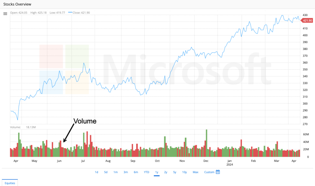
Volume Oscillator
We’ve saved a particularly insightful indicator for the finale of our volume series: the Volume Oscillator (VO). While other indicators combine price and volume, the Volume Oscillator has a pure and singular focus: the speed and momentum of volume itself. It helps you answer the critical question: “Is volume activity accelerating or decelerating?”
What is the Volume Oscillator (VO)?
The Volume Oscillator is a momentum indicator that measures the difference between two moving averages of volume. It is typically displayed as a histogram that oscillates above and below a zero line.
Its Purpose: To identify trends in volume strength. It filters out the noise of daily volume fluctuations to show whether volume momentum is increasing or decreasing, which often precedes significant price moves.
Its Core Insight: Changes in volume momentum often lead changes in price momentum. A sudden surge in volume activity (shown by the VO) can be a leading signal for a potential price breakout or breakdown.
How is the Volume Oscillator Measured?
The calculation is straightforward and is similar to the MACD, but applied to volume instead of price.
Volume Oscillator = (Fast Volume Moving Average – Slow Volume Moving Average)
The most common settings are:
Fast MA: A 14-period moving average of volume.
Slow MA: A 28-period moving average of volume.
These moving averages are almost always Simple Moving Averages (SMA) for this specific indicator.
How it’s displayed:
The result is plotted as a histogram.
Positive VO Value (Histogram above zero): The short-term volume average is higher than the long-term volume average. Volume is increasing.
Negative VO Value (Histogram below zero): The short-term volume average is lower than the long-term volume average. Volume is decreasing.
Zero Line Cross: When the fast MA crosses above the slow MA, the VO crosses above zero. When the fast MA crosses below the slow MA, the VO crosses below zero.
How is the Volume Oscillator Used?
The VO is not used in isolation. Its power is unleashed when combined with price action. Here’s how to interpret its signals:
1. Confirming Breakouts and Trends (The Primary Use)
This is the most reliable application of the VO.
Bullish Confirmation: A price breakout above resistance should be accompanied by the VO moving strongly above its zero line. This confirms that the breakout is supported by surging volume momentum, making it more valid.
Bearish Confirmation: A price breakdown below support should be accompanied by the VO moving strongly below its zero line. This confirms that the sell-off is driven by intense selling pressure.
2. Identifying Divergences (A Powerful Warning Signal)
Bearish Divergence: The price makes a new high, but the VO makes a lower high (or fails to reach its previous high). This indicates that the price is rising, but the volume momentum behind the move is waning. This is a classic warning of a weak, unsustainable rally.
Bullish Divergence: The price makes a new low, but the VO makes a higher low (or fails to make a new low). This indicates that the price is falling, but the selling pressure (volume momentum) is diminishing. This can signal that a bottom is near.
3. Spotting Volume Climaxes
An extremely high reading on the VO histogram (a very tall bar) often represents a volume climax. This can signal exhaustion and a potential reversal point, especially if it occurs after a prolonged trend.
A huge positive VO bar at a market top can be a buying climax.
A huge negative VO bar at a market bottom can be a selling climax.
4. Zero Line as a Bullish/Bearish Signal
Generally, a VO above zero is considered bullish, indicating above-average volume activity.
A VO below zero is considered bearish, indicating below-average volume activity.
A cross above zero can be seen as a buy signal for volume-driven traders.
A cross below zero can be seen as a sell signal.
A Practical Example:
Imagine a stock has been trading sideways.
Day of Breakout: The price closes above its 50-day resistance level.
Volume Analysis:
The raw volume bar is very tall.
The Volume Oscillator would show a massive green histogram bar soaring high above the zero line.
Interpretation: This isn’t just a high-volume day; it’s a day where volume momentum exploded. This strongly confirms the bullish breakout, giving you much higher confidence in the trade.
Key Takeaways:
Momentum, Not Just Level: The VO measures the rate of change of volume, which is often more important than the absolute level. It tells you if volume is accelerating or decelerating.
The Ultimate Confirmation Tool: Its best use is to confirm the validity of price-based signals like breakouts and breakdowns. No VO confirmation? Be skeptical of the move.
A Leading Indicator: Because volume changes often lead price changes, divergences on the VO can provide early warnings of potential trend weakness or strength.
Customizable: While 14/28-period MAs are standard, traders can adjust these to be more sensitive (e.g., 5/20) or slower (e.g., 20/40) depending on their trading style and the security’s volatility.
Completes the Picture: The VO adds the final piece to volume analysis. You now have:
Raw Volume: The basic fuel.
Volume-Based Indicators (OBV, PVT, MFI): How volume interacts with price.
Volume Oscillator: The momentum and trend of the fuel itself.
By adding the Volume Oscillator to your chart, you move from simply observing volume to analyzing its trend and momentum. This allows you to anticipate periods of high activity and confirm that the market’s “engine” is truly powering the price move you see on the screen.
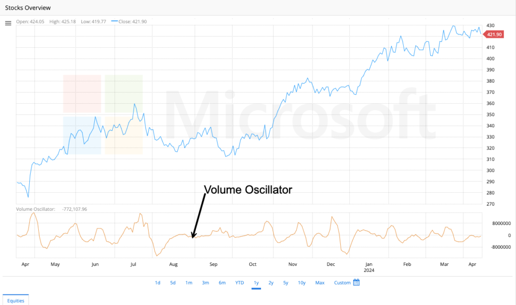
Interactive Analysis
Fibonacci Fan
Welcome to our new series on interactive analysis tools! We’re starting with a sophisticated and visually striking tool: the Fibonacci Fan. This tool doesn’t rely on horizontal lines alone; instead, it draws dynamic diagonal lines that can predict potential support and resistance levels throughout a trend’s lifespan.
What is the Fibonacci Fan?
The Fibonacci Fan is a charting technique that consists of three diagonal lines, each drawn from a significant trend extreme (high or low) and angled based on key Fibonacci ratios. These lines are used to identify potential levels of support in an uptrend and levels of resistance in a downtrend.
The core idea is that markets often correct or advance in rhythms related to the Fibonacci sequence, and these diagonal lines can forecast where buyers or sellers might step in as the trend evolves over time.
How is the Fibonacci Fan Measured and Drawn?
The tool is applied by connecting two points: a significant trough and a significant peak (in an uptrend), or a significant peak and a significant trough (in a downtrend).
For an Uptrend:
Identify the Swing Low: Find the most significant trough before the major price advance.
Identify the Swing High: Find the most significant peak of that advance.
Draw the Fan: The drawing tool (available on most charting platforms) will automatically draw three lines from the swing low, passing through invisible vertical levels at 38.2%, 50%, and 61.8% of the price range between the low and high.
For a Downtrend:
Identify the Swing High: Find the most significant peak before the major price decline.
Identify the Swing Low: Find the most significant trough of that decline.
Draw the Fan: The tool draws three lines from the swing high, passing through the 38.2%, 50%, and 61.8% retracement levels of the price decline.
The resulting three lines are the Fibonacci Fan lines. The most important ones are typically the 61.8% line and the 38.2% line.
How is the Fibonacci Fan Used?
The fan lines act as dynamic support (in uptrends) or resistance (in downtrends). The key to using them is observing how the price interacts with these diagonal levels.
1. Identifying Support in an Uptrend
After a peak, the price will often retrace. In a healthy uptrend, the pullback may find support at one of the ascending fan lines. The 61.8% line is often watched most closely. A bounce off this line suggests the underlying uptrend is still intact.
2. Identifying Resistance in a Downtrend
After a trough, a price bounce may struggle to break above one of the descending fan lines. The 61.8% line often acts as strong resistance. A rejection from this line suggests the underlying downtrend is still in force.
3. Gaugining Trend Strength
Strong Trend: If a price pullback in an uptrend finds support at the 38.2% fan line and rallies, it indicates very strong bullish momentum.
Weaker Trend: If the price falls further to find support at the 61.8% fan line, the trend is still valid but the momentum is weaker.
Trend Breakdown/Reversal: If the price slices through the 61.8% fan line and cannot reclaim it, it is a strong signal that the prior trend may be reversing.
4. Time-Based Projections
Unlike horizontal Fibonacci retracements, the Fan incorporates time. The lines slope, meaning the support/resistance level is different each day. This makes them excellent for forecasting where support might be when the price gets there next week or next month.
A Practical Example: Bull Market Pullback
Imagine a stock rallies from a low of $100 (Point A) to a high of $200 (Point B).
The total price range is $100.
The 38.2% retracement level is at $162 ($200 – ($100 * 0.382)).
The 61.8% retracement level is at $138 ($200 – ($100 * 0.618)).
When you draw the Fibonacci Fan from $100 (A) to $200 (B), the fan lines won’t be horizontal. They will angle upward. As the price pulls back from $200 over the next several weeks, the 61.8% fan line will be rising day-by-day. The price might find support at this rising line around $150 two weeks into the pullback, a level that a simple horizontal tool would not have predicted.
Key Takeaways:
Dynamic vs. Static: This is the key advantage. Unlike horizontal lines, the Fan provides moving targets for support/resistance that adjust over time.
Trend Following Tool: It is primarily used to identify potential entry points within a larger trend (buying the dip in an uptrend, selling the rip in a downtrend).
Confirmation is Key: A bounce or rejection from a fan line is a signal, not a guarantee. Always confirm with other factors, such as:
Price Action: Look for bullish candlestick patterns (hammers, engulfing patterns) at support.
Volume: Volume should increase as the price bounces off the support line.
Other Indicators: The move could be confirmed by an RSI moving out of oversold territory.
Not a Standalone Tool: The Fibonacci Fan is most powerful when used in conjunction with other forms of analysis, such as traditional horizontal Fibonacci retracements, trend lines, and momentum indicators.
By mastering the Fibonacci Fan, you add a dynamic, time-sensitive dimension to your support and resistance analysis, allowing you to anticipate where the market might find equilibrium on its charted path.
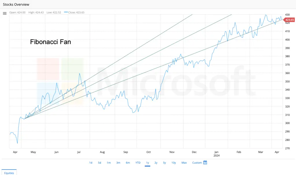
Fibonacci Arc
Next in our series on interactive Fibonacci tools, we explore the Fibonacci Arcs. While the Fan uses diagonal lines and the Retracement uses horizontal lines, Arcs introduce a dynamic, curved approach to predicting potential reversal zones. They help answer the question: “Where might the price find support or resistance, and when might it get there?”
What are Fibonacci Arcs?
Fibonacci Arcs are semi-circular lines drawn on a chart that represent potential areas of support and resistance based on key Fibonacci ratios (primarily 38.2%, 50%, and 61.8%). They are drawn by measuring the vertical distance of a significant price move and then projecting curved lines from the trend’s endpoint that intersect with the Fibonacci levels.
The unique feature of Arcs is that they incorporate time. The curves mean that the predicted support or resistance level changes with each passing period, creating a moving target that slopes either upward or downward.
How are Fibonacci Arcs Measured and Drawn?
The construction of Fibonacci Arcs is a two-step process centered on a significant price swing.
For an Uptrend:
Identify the Trend Wave: Find the most significant trough (Point A) and the subsequent peak (Point B). This defines the trend’s range.
Draw the Arcs: The tool draws three arcs originating from the peak (Point B). The radius of each arc is determined by the Fibonacci percentage of the initial price range (High – Low).
The first arc has a radius of 38.2% of the trend wave’s height.
The second arc has a radius of 50.0% of the height.
The third and most important arc has a radius of 61.8% of the height.
For a Downtrend:
Identify the Trend Wave: Find the most significant peak (Point A) and the subsequent trough (Point B).
Draw the Arcs: The three arcs are drawn from the trough (Point B), with their radii again set at 38.2%, 50%, and 61.8% of the overall price decline.
The Key Insight: The arcs intersect the price chart at different points in the future, creating curved support (in an uptrend) or resistance (in a downtrend) levels.
How are Fibonacci Arcs Used?
Fibonacci Arcs are used to identify potential zones where a pullback or counter-trend bounce might end and the primary trend might resume.
1. Identifying Support in an Uptrend
After a price peaks (Point B), it will retrace. The descending arcs provide potential levels where this pullback may find support and reverse. Traders watch for the price to approach the 61.8% arc—the most significant level—and look for bullish reversal candlestick patterns (e.g., a hammer, bullish engulfing) as confirmation to enter a long trade.
2. Identifying Resistance in a Downtrend
After a price bottoms (Point B), it will rally. The ascending arcs provide potential levels where this rally may meet resistance and reverse. The 61.8% arc is again the key level to watch for potential bearish rejection.
3. The Time Factor
This is what sets Arcs apart. Because the arcs are curved, the suggested support/resistance price changes each day.
A horizontal Fibonacci retracement level is static (e.g., always at $150).
A Fibonacci Arc level is dynamic (e.g., it might be at $155 this week and $148 next week).
This allows Arcs to model the natural ebb and flow of market rhythms, where the speed of a trend’s pullback is often as important as its depth.
A Practical Example:
Imagine a stock rallies from $50 (Point A – the trough) to $100 (Point B – the peak).
The total price range is $50.
The radius for the 61.8% arc is $50 * 0.618 = $30.90.
The drawing tool will place an arc originating at the $100 peak with a radius of $30.90. This arc will curve downward and intersect the price chart at a future date. The price may find support at this curving arc level, which might be around $69.10 ($100 – $30.90) initially, but will slope upward over time as the arc curves.
Key Takeaways:
Dynamic & Curved: Arcs provide moving, curved support and resistance levels, unlike the static horizontal lines of retracements.
Incorporates Time: They are one of the few Fibonacci tools that directly factor time into the equation for predicting support/resistance.
The 61.8% Arc is Key: The most reliable signals often occur around the arc based on the 61.8% Fibonacci ratio.
Confirmation is Essential: A price approaching an arc is a potential reversal zone (PRZ), not a guaranteed reversal. Always wait for confirmation from:
Price Action: A bullish or bearish candlestick reversal pattern.
Other Tools: The arc level often aligns beautifully with a traditional Fibonacci retracement level or a trendline, creating a “cluster” of evidence.
Best for Ranging or Shallow Trends: Arcs can become less reliable in very strong, parabolic trends where the price blows right through the arc levels without pausing.
Comparison of Fibonacci Tools:
| Tool | What it Measures | Best For |
|---|---|---|
| Retracement | Price (Static Levels) | Finding precise % pullback levels. |
| Fan | Price + Time (Diagonal Lines) | Finding dynamic support in a trend. |
| Arcs | Price + Time (Curved Lines) | Modeling the rhythm of a trend’s pullback. |
By adding Fibonacci Arcs to your analysis, you gain a unique tool that helps you visualize the market’s natural cycles and anticipate where and when a trend might find its footing.
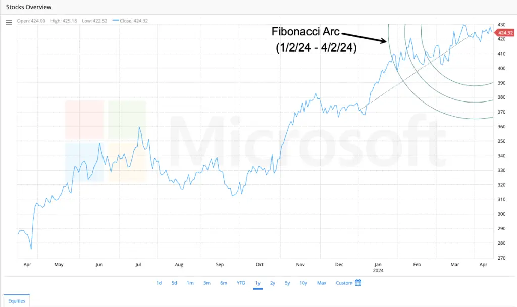
Fibonacci Retracement
f you only learn one Fibonacci tool, make it this one. The Fibonacci Retracement tool is a cornerstone of technical analysis, used by countless traders to identify strategic levels where a trending stock might pause, pull back, and then continue in its original direction. It provides a potential “roadmap” for price corrections.
What is Fibonacci Retracement?
Fibonacci Retracement is a technical analysis tool that plots horizontal lines on a chart at key Fibonacci ratios (percentages) of a prior significant price move. These lines represent potential support levels during a pullback in an uptrend and potential resistance levels during a bounce in a downtrend.
The core concept is based on the idea that markets do not move in straight lines. After a significant price advance or decline, the market often “retraces” a predictable portion of the original move before resuming the overall trend. These retracement levels are where traders anticipate a reversal of the counter-trend move.
How is Fibonacci Retracement Measured and Drawn?
The tool is applied by connecting two points: the start and the end of a significant price swing.
For an Uptrend:
Identify the Swing Low: Find the most significant trough before the major price advance (Point A).
Identify the Swing High: Find the most significant peak of that advance (Point B).
Draw the Retracement: Click on the swing low (A) and drag the tool to the swing high (B). The software will automatically draw horizontal lines at the key Fibonacci levels below the peak.
For a Downtrend:
Identify the Swing High: Find the most significant peak before the major price decline (Point A).
Identify the Swing Low: Find the most significant trough of that decline (Point B).
Draw the Retracement: Click on the swing high (A) and drag the tool to the swing low (B). The software will draw horizontal lines at the key Fibonacci levels above the trough.
The most critical Fibonacci retracement levels are:
23.6%: A shallow pullback. Indicates a very strong trend.
38.2%: A moderate pullback. A common retracement level.
50.0%: While not an official Fibonacci number, this is a widely watched psychological level due to Dow Theory and Gann’s work.
61.8%: The “golden ratio.” This is the most important retracement level. A deep retracement to this level is very common.
78.6%: A deep retracement (this is the square root of 61.8%).
100%: A full retracement, which would negate the original move.
How is Fibonacci Retracement Used?
Traders use these levels to find high-probability zones for entering trades in the direction of the overarching trend.
1. Finding Support in an Uptrend (“Buying the Dip”)
After a stock peaks, it will pull back. A trader will watch for the price to approach a key Fibonacci level (e.g., the 38.2%, 50%, or 61.8% line) and look for signs of support—a bullish candlestick pattern (like a hammer or bullish engulfing), a bounce in a momentum oscillator like the RSI, or simply a rejection of the level. This provides a potential entry point to buy with a stop-loss placed below the next Fibonacci level or below the swing low.
2. Finding Resistance in a Downtrend (“Selling the Rally”)
After a stock bottoms, it will often bounce. A trader will watch for the price to rally into a key Fibonacci level and show signs of weakness—a bearish candlestick pattern (like a shooting star or bearish engulfing), or a rejection from the level. This provides a potential entry point to short-sell or exit long positions, with a stop-loss placed above the level.
3. confluence Adds Strength
A Fibonacci level becomes much more powerful when it aligns (is in “confluence”) with other technical factors:
Price Gaps: A retracement level that lines up with a price gap.
Moving Averages: The 50-day or 200-day Simple Moving Average often sits near a key Fibonacci level.
Previous Support/Resistance: A horizontal support/resistance level from the past.
Trendlines: The retracement level touches a longer-term trendline.
The more factors that cluster at one price, the stronger that level becomes.
A Practical Example:
Imagine a stock rallies from $100 (Swing Low) to $200 (Swing High).
The total price range is $100.
The key retracement levels are calculated from the high:
38.2% Retracement: $200 – ($100 * 0.382) = $161.80
50.0% Retracement: $200 – ($100 * 0.5) = $150.00
61.8% Retracement: $200 – ($100 * 0.618) = $138.20
As the price falls from $200, a trader would watch these levels closely. A bounce from $161.80 shows strength. A deeper fall to $150 or $138.20 is still within a normal correction. A break below $138.20, however, would suggest the pullback might be turning into a full-blown reversal.
Key Takeaways:
It’s a Probability Tool, Not a Crystal Ball: Fibonacci levels are zones, not exact prices. They indicate areas where the probability of a reversal is higher.
The Trend is Your Friend: Always use retracements in the context of the larger trend. Look for buy signals on pullbacks in an uptrend, not in a downtrend.
61.8% is King: The 61.8% level is the most revered and commonly acted upon.
Wait for Confirmation: Never blindly buy or sell at a level. Always wait for price action confirmation (a candlestick reversal pattern) before entering a trade.
Confluence is Key: A retracement level that overlaps with another indicator is a much stronger signal than a Fibonacci level alone.
By mastering Fibonacci Retracements, you equip yourself with a powerful framework for making sense of market noise, allowing you to plan your trades at levels with a higher historical probability of success.
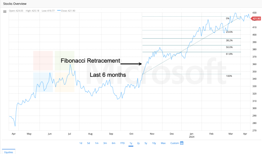
Fibonacci TimeZones
What are Fibonacci Time Zones?
Fibonacci Time Zones are a technical analysis tool consisting of a series of vertical lines spaced according to the Fibonacci sequence (1, 1, 2, 3, 5, 8, 13, 21, 34, etc.). These lines are overlaid on a price chart to indicate potential points in the future where significant price action may occur, such as a trend reversal or a sharp acceleration.
Unlike retracements or fans, Time Zones ignore price levels entirely. They are purely concerned with time cycles, based on the premise that market movements are influenced by natural rhythmic cycles that correspond to Fibonacci numbers.
How are Fibonacci Time Zones Measured and Drawn?
The application of Time Zones is a two-step process focused on identifying a significant trend duration.
Identify the Base Unit: Find a significant price swing—this could be from a major trough to a major peak, or between two important market lows. The length of this swing (in terms of number of bars, e.g., days or weeks) becomes your “1” unit or base period.
Draw the Zones: The drawing tool is applied from the start of the base swing (e.g., the initial trough). The software then plots vertical lines into the future at intervals corresponding to Fibonacci numbers (1, 2, 3, 5, 8, 13, 21, etc. periods from the start point).
Important Note: The spacing is based on the number of periods, not the price distance. Each vertical line represents a potential “time window” for a market event.
How are Fibonacci Time Zones Used?
The core idea is that the vertical lines represent potential acceleration or reversal zones in time. Traders use them to anticipate periods of increased volatility or trend change.
1. Anticipating Reversals
The most common use is to watch for price action at or near a Fibonacci Time Zone line. If the price is also showing signs of exhaustion (e.g., divergence with an RSI or MACD, a climax candlestick pattern) at that time, it significantly increases the probability of a reversal.
2. Identifying Acceleration Points
Sometimes, instead of a reversal, a Time Zone can mark the point where a trend accelerates. A breakout from a consolidation pattern that occurs right on a Time Zone line can be a powerful signal, suggesting the move has strong timing alignment.
3. Combining with Other Tools (This is Crucial)
Fibonacci Time Zones are notoriously imprecise on their own. Their power is magnified exponentially when they align with other technical factors—a concept known as “time-based confluence.”
Price Confluence: A Time Zone line that aligns with a key Fibonacci retracement level (e.g., 61.8%) or a major horizontal support/resistance level.
Pattern Confluence: A Time Zone line that appears right as a chart pattern (like a head and shoulders or a triangle) is completing.
Indicator Confluence: A Time Zone that coincides with a momentum indicator moving into overbought or oversold territory.
A Practical Example:
Imagine a stock forms a major low on January 1st and rallies for 55 days before forming a major high on February 25th.
A trader might use this 55-day swing (a Fibonacci number itself) as the key input.
They would draw Fibonacci Time Zones starting from the January 1st low.
The tool would then plot vertical lines at 55, 110, 165, 220, etc. days after the initial low.
The trader would then be on high alert for potential trend changes or significant price action around day 110 and day 165 from the start point, especially if the price is also at a key Fibonacci retracement level at that future time.
Key Takeaways:
Time vs. Price: This is the critical distinction. Time Zones forecast when, while other tools forecast where.
Imprecise but Suggestive: A Time Zone does not predict the exact bar of a reversal. It identifies a window of time (often a few bars to the left and right of the line) where a pivot is more likely to occur. Think of the vertical line as the center of a “danger zone” or “opportunity zone.”
Confluence is Everything: A Time Zone signal in isolation is weak. A Time Zone that aligns with a price level, a pattern, and an indicator is exceptionally strong.
Best for Longer Timeframes: Like most cycle tools, Fibonacci Time Zones are more reliable on daily, weekly, or monthly charts than on short-term intraday charts, where noise can dominate.
Experiment with the Start Point: There is subjectivity in choosing the initial swing to measure. Analysts often experiment with drawing zones from different significant highs and lows to find where the lines cluster, indicating a very important potential turning point.
Comparison of Fibonacci Tools:
| Tool | What it Forecasts | Key Feature |
|---|---|---|
| Retracement | Price (Support/Resistance) | Horizontal Levels |
| Fan | Price + Time (Dynamic S/R) | Diagonal Lines |
| Arcs | Price + Time (Curved S/R) | Curved Lines |
| Time Zones | Time (Reversal Zones) | Vertical Lines |
By understanding Fibonacci Time Zones, you add a powerful temporal dimension to your analysis. You’re no longer just asking “How low will it go?” but also “How long until it gets there or reverses?” This allows for a more complete market analysis and better-prepared trading strategies.
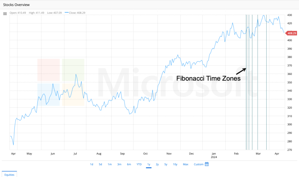
Gann Fan
The Gann Fan was d developed by the legendary early 20th-century trader W.D. Gann. This tool is based on the theory that price and time are related geometrically. Unlike Fibonacci tools, which focus on price ratios, the Gann Fan creates dynamic support and resistance lines based on specific angles, representing the ideal equilibrium between price and time.
What is a Gann Fan?
A Gann Fan is a set of diagonal lines, called Gann Angles, drawn from a significant market top or bottom. These angles are used to identify key levels of support and resistance and to gauge the strength and timing of a trend.
Gann’s core belief was that the ideal, healthy trend advances at a specific angle—most importantly, a 45-degree angle (also called the 1×1 angle). This angle represents a perfect balance where one unit of price advance occurs for one unit of time (e.g., a stock rises $1 per day, or 1 point per day).
Above the 1×1 line: The trend is stronger than average (e.g., rising $2 per day). This is considered bullish.
Below the 1×1 line: The trend is weaker than average (e.g., rising $0.50 per day). This is considered bearish.
How is the Gann Fan Measured and Drawn?
The construction of the Gann Fan is precise and relies on scaling the chart correctly, which was crucial to Gann’s original methods.
Identify the Anchor Point: Select a major swing low (in an uptrend) or a major swing high (in a downtrend). This is the point from which all angles will emanate.
Establish the Scale (The Most Critical Step): For the angles to be accurate, the chart must have a 1:1 ratio between price and time. This means one unit of price on the y-axis must take up the same amount of chart space as one unit of time (e.g., one day, one bar) on the x-axis. Most modern platforms do this automatically when you select the “Gann Fan” tool.
Draw the Fan: The tool will draw several key angles from the anchor point. The most important ones are:
1×1 Angle (45°): The main angle. Represents one unit of price per one unit of time.
1×2 Angle (Steeper): Represents one unit of price per two units of time. This is a weaker angle than 1×1.
2×1 Angle (Shallower): Represents two units of price per one unit of time. This is a stronger angle than 1×1.
Other common angles include the 1×4, 1×8, 4×1, and 8×1, each representing a different price-time relationship.
How is the Gann Fan Used?
The fan lines act as dynamic support (in uptrends) or resistance (in downtrends). The interpretation is all about the price’s relationship to these angles.
1. Gauging Trend Strength
This is the primary use.
In an Uptrend: As long as the price remains above the rising 1×1 angle, the trend is considered healthy and in a state of ideal balance. If the price climbs and stays between the 2×1 and 1×1 angles, it indicates very strong bullish momentum.
In a Downtrend: As long as the price remains below the descending 1×1 angle, the downtrend is intact. If it stays between the 1×1 and 2×1 angles, the selling pressure is very strong.
2. Identifying Support and Resistance
In an uptrend, the Gann angles (especially the 1×1 line) will often act as dynamic support. A bounce off the 1×1 line is a bullish sign, suggesting the trend is resuming its ideal pace.
In a downtrend, the angles act as dynamic resistance. A rejection from the 1×1 line is a bearish sign.
3. Signaling Trend Changes
A decisive break below the 1×1 angle in an uptrend is a major warning sign that the trend’s momentum is weakening and a reversal or consolidation may be imminent.
A decisive break above the 1×1 angle in a downtrend signals that selling pressure is abating and a reversal higher is more likely.
A Practical Example:
Imagine a stock hits a major low at $50.
You draw the Gann Fan from that $50 low.
The 1×1 angle will then project forward, rising by $1 for every day that passes.
If the stock is trading at $70 after 20 days, it is trading right on the 1×1 angle ($50 + $20 = $70). This indicates a perfectly healthy trend.
If the stock is trading at $80 after 20 days, it is trading above the 1×1 angle (which is at $70), indicating very strong momentum.
If the stock is trading at $65 after 20 days, it is trading below the 1×1 angle, indicating weakness and a potential trend failure.
Key Takeaways:
Price-Time Relationship: This is the unique core of Gann theory. It’s not just where price is, but how fast it got there.
The 1×1 Angle is Everything: The 45-degree angle is the most important line on the chart, representing the equilibrium between price and time.
Dynamic Support/Resistance: The angles provide moving targets for support and resistance, similar to a trendline but with a mathematically defined slope.
Subjectivity and Scale: The biggest criticism of Gann tools is the subjectivity in choosing the correct anchor point and the historical need for precise chart scaling. Modern platforms handle scale automatically, but choosing the right high or low is an art.
Use for Confirmation, Not Prediction: The Gann Fan is best used to confirm the strength of an existing trend or warn of its weakness. It is less effective as a standalone predictive tool.
Part of a Larger System: The Gann Fan was just one tool in W.D. Gann’s vast arsenal, which also included squaring of time, price patterns, and astrological cycles. Most modern traders use the fan in isolation or combined with other, simpler technical methods.
By incorporating the Gann Fan, you add a layer of geometric analysis to your charts, allowing you to assess not just the direction of a trend, but the quality and sustainability of its momentum.
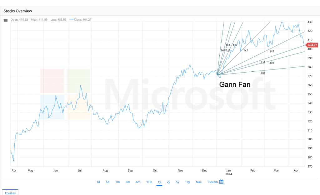
Mean Tirone Levels
Next in our toolkit is a versatile indicator that helps define the range of a trend and spot potential reversal points: the Tirone Levels. This tool uses a series of horizontal lines based on a key statistical concept—the mean—to map out critical support and resistance zones.
What are Tirone Levels?
Tirone Levels are a set of three parallel horizontal lines that are drawn over a price chart to identify potential support and resistance levels within a defined trend. The lines are calculated based on the high and low of a selected price range, creating a “value area” for the security.
The three lines are:
The Central Mean Line: The average price of the selected range.
The Upper Line: A resistance level above the mean.
The Lower Line: A support level below the mean.
The core idea is that price tends to revert to its mean (the central line) after reaching extreme highs (upper line) or lows (lower line). This makes it excellent for range-bound markets and for identifying overbought/oversold conditions within a trend.
How are Tirone Levels Measured and Drawn?
There are two primary methods for drawing Tirone Levels. Most modern charting platforms will do these calculations automatically once you select the high and low anchor points.
Method 1: The Mean Method (Most Common)
Identify the Trend Range: Select a significant low point and a significant high point within the trend you want to analyze.
Calculate the Central Mean Line: This is the simple mathematical average of the high and low.
Central Mean = (High + Low) / 2Calculate the Upper and Lower Lines:
Upper Line (Resistance 1):
High - ((High - Low) * 0.33)Lower Line (Support 1):
Low + ((High - Low) * 0.33)
Method 2: The Fibonacci Method
John Tirone also developed a method using Fibonacci ratios, which is very similar to Fibonacci retracements but applied differently.
Central Mean Line:
High - ((High - Low) * 0.5)(The 50% retracement level)Upper Line (Resistance 1):
High - ((High - Low) * 0.33)(Approximates the 33% retracement)Lower Line (Support 1):
High - ((High - Low) * 0.66)(Approximates the 66% retracement)
Many traders also add secondary lines at other key Fibonacci levels (38.2%, 61.8%) for more granular analysis.
How are Tirone Levels Used?
Tirone Levels are used to identify trading ranges, mean-reversion opportunities, and the strength of a trend.
1. Identifying Support and Resistance in a Range
The primary use is in a sideways or consolidating market. The upper and lower lines act as clear boundaries for the range.
Traders might look to sell or short when price approaches the Upper Line and shows signs of rejection (e.g., a bearish doji or shooting star candle).
Traders might look to buy when price approaches the Lower Line and shows signs of support (e.g., a bullish hammer or engulfing pattern).
2. Mean Reversion Strategy
The Central Mean Line acts as a magnet for price.
After a rally to the Upper Line, a pullback toward the Central Mean is expected.
After a drop to the Lower Line, a bounce toward the Central Mean is expected.
A trader could take profits at the extremes and re-enter near the mean.
3. Gauging Trend Strength
In an Uptrend: If the price is consistently bouncing off the Upper Line and the Central Mean, it indicates strong bullish momentum. The levels can act as a “rising channel” of support.
In a Downtrend: If the price is consistently rejecting from the Lower Line and the Central Mean, it indicates strong bearish momentum.
Breakouts: A decisive break above the Upper Line suggests the range is ending and a new uptrend is beginning. A break below the Lower Line suggests a new downtrend is starting.
A Practical Example:
Imagine a stock has been trading between a low of $100 and a high of $130.
Central Mean Line: ($130 + $100) / 2 = $115
Upper Line (Resistance): $130 – (($130 – $100) * 0.33) = $130 – $10 = $120
Lower Line (Support): $100 + (($130 – $100) * 0.33) = $100 + $10 = $110
A trader would now watch for buying opportunities near $110 and selling opportunities near $120, with the $115 line acting as a short-term target for both moves.
Key Takeaways:
Dynamic Range Finder: Tirone Levels are excellent for defining the upper, lower, and middle bounds of a trading range.
Mean Reversion Tool: They are fundamentally based on the concept that price reverts to the mean, making them ideal for non-trending, choppy markets.
Flexible Application: They can be applied to any time frame and to any significant high and low, making them useful for both short-term traders and long-term investors.
Confirmation is Key: As with all support/resistance tools, wait for price action confirmation (a candlestick reversal pattern) before acting at a level.
Complementary to Other Tools: Tirone Levels work very well alongside volume indicators (e.g., low volume at the mean, high volume at the extremes) and momentum oscillators like the RSI (looking for divergence at the Upper or Lower lines).
Comparison to Other Tools:
| Tool | Primary Use | Key Feature |
|---|---|---|
| Fibonacci Retracement | Predicting pullback depth | Horizontal lines based on % ratios |
| Pivot Points | Predicting daily S/R | Calculated from prior day’s H, L, C |
| Tirone Levels | Defining a value range | Horizontal lines based on the mean and extremes of a range |
| Gann Fan | Gauging trend momentum | Diagonal lines based on price-time angles |
By adding Tirone Levels to your analysis, you gain a statistically-grounded framework for understanding a security’s “value area,” allowing you to make more disciplined decisions about when to buy low and sell high within a defined trend.